Tag Archives: vikpahwa.com
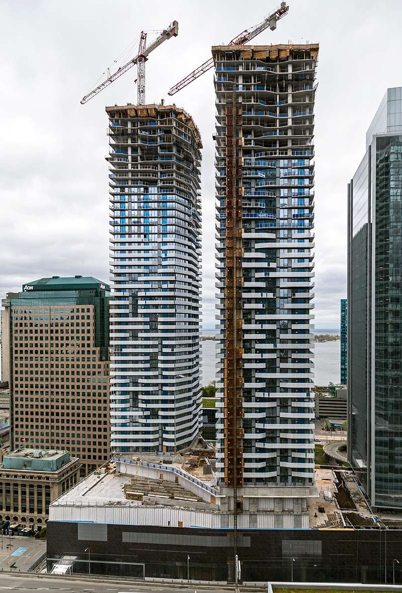
20160523. An aerial view of Toronto’s quickly rising Harbour Plaza Residences.
20160519. Condo towers in Toronto’s Distillery District provide examples of compatibility and contrast in contextual design.
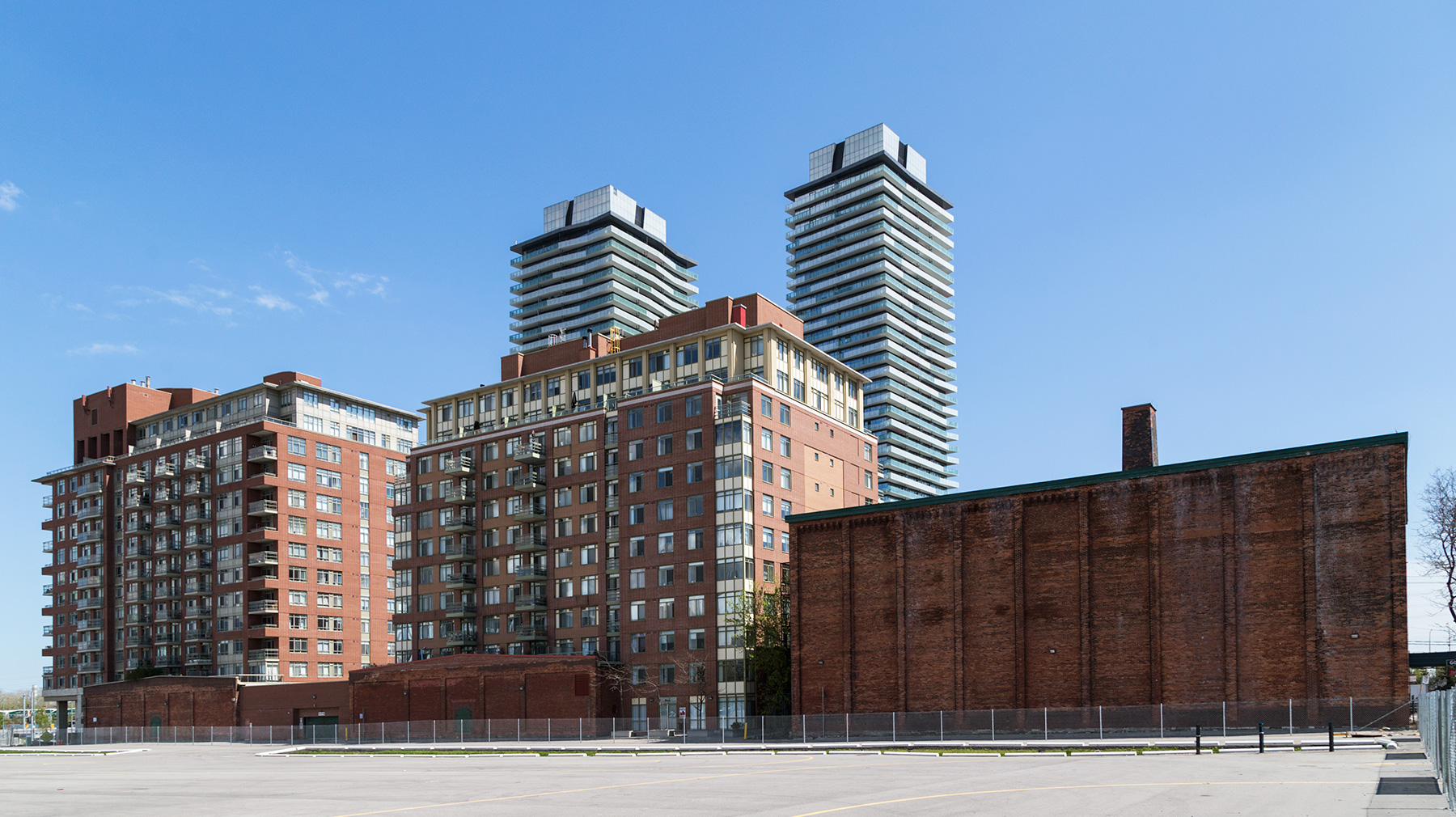 The white and blue towers contrast strikingly with the historic distillery buildings whereas the red towers seem compatible in shape and colour.
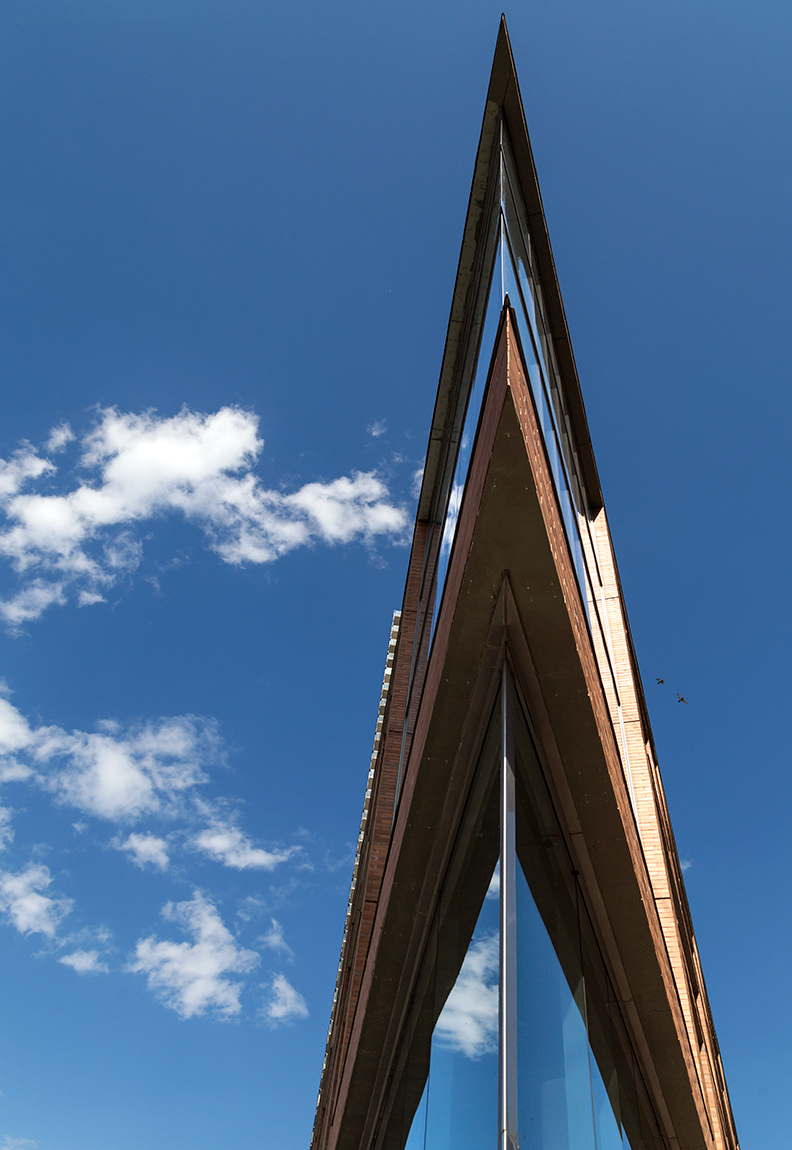
20160518. Making a point with architecture in Toronto’s Distillery District. Minimal Aesthetic 90.
20160516. A warehouse demolition reveals an appealing steel frame in Toronto’s Riverside neighbourhood.
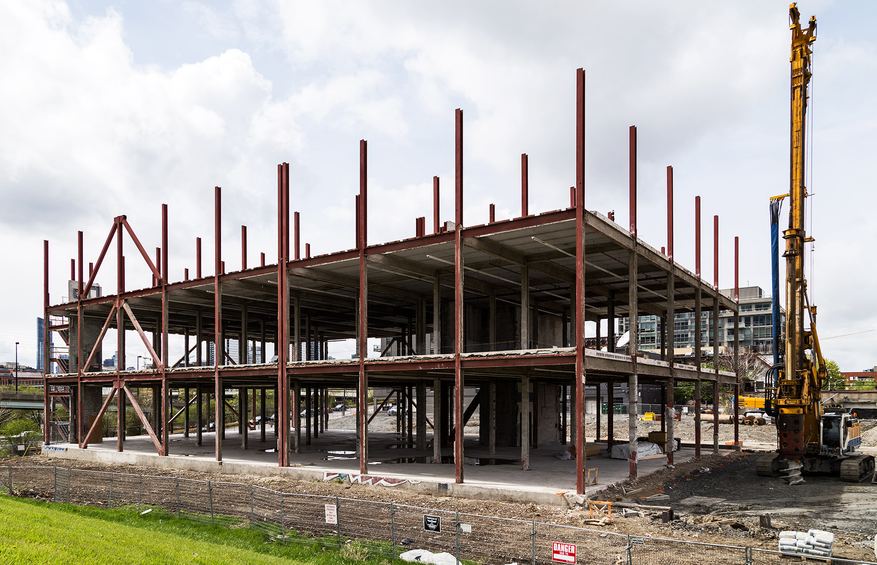 Demolition of this former concrete warehouse makes way for the large Riverside Square development by Streetcar Developments.
20160515. An empty Gardiner Expressway in Toronto frames a shaded double conventional high pressure sodum lighting pole.
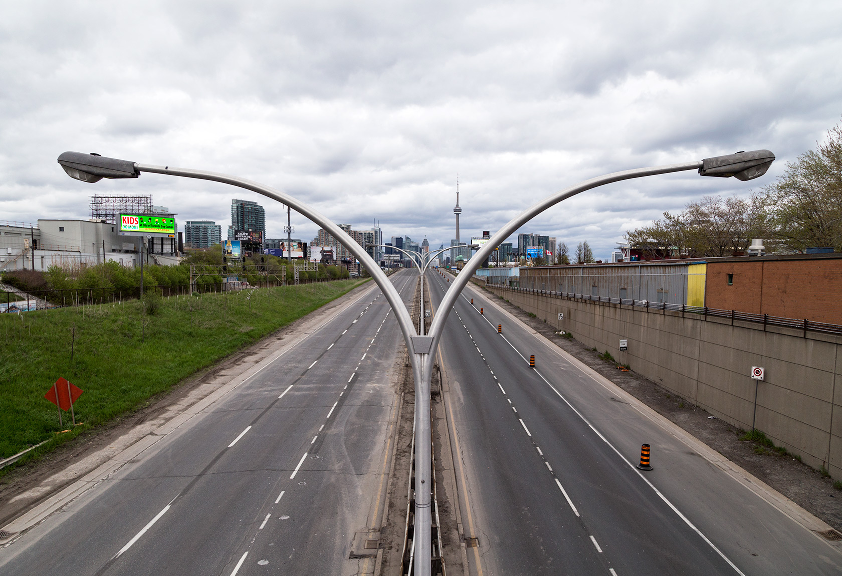 The highway is closed this weekend for annual Spring maintenance.
20160514 Today marks 5 years for this photo blog. Thanks for looking!
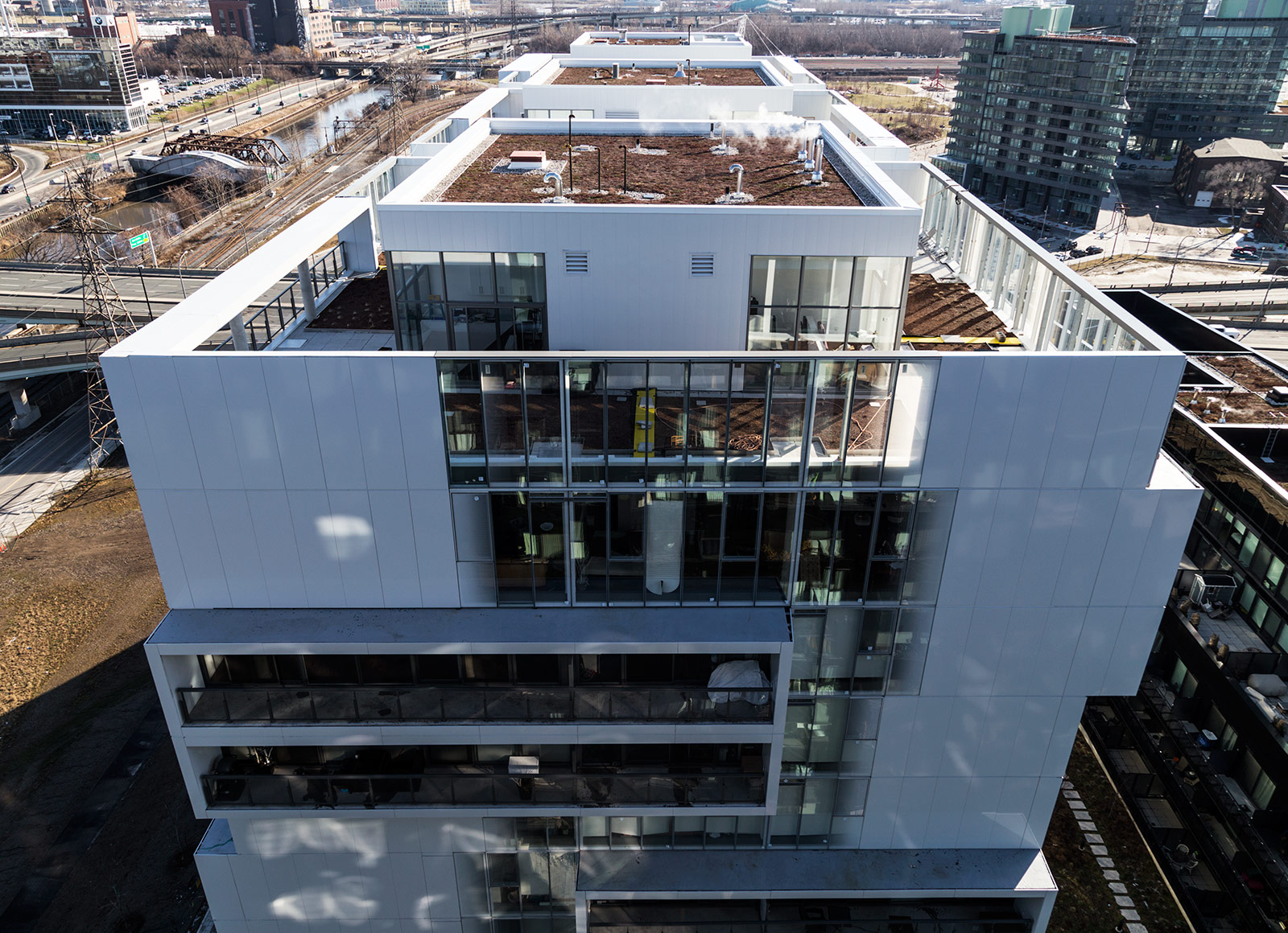
20160513. A rooftop view of Toronto’s River City Phase 2.
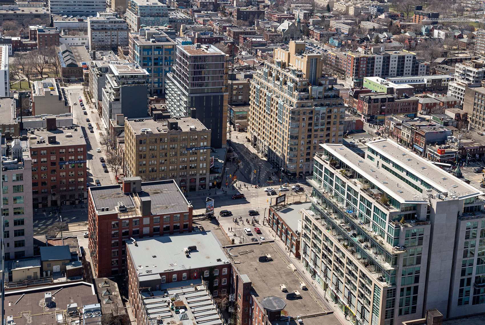
20160512. An aerial view of Toronto’s Fashion District and the northern border of the King-Spadina Heritage Conservation District.
20160511. Under the Unilever Water Tower.
 *
*
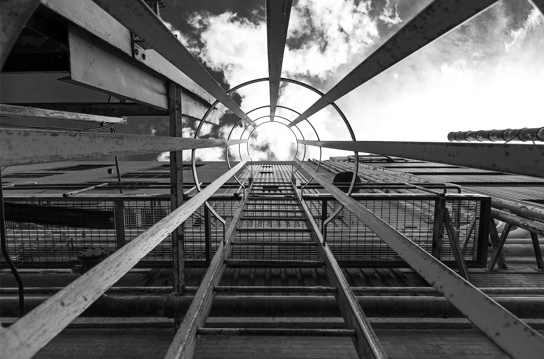
20160509. A ringed vertical ladder perspective at Toronto’s former Unilever factory.
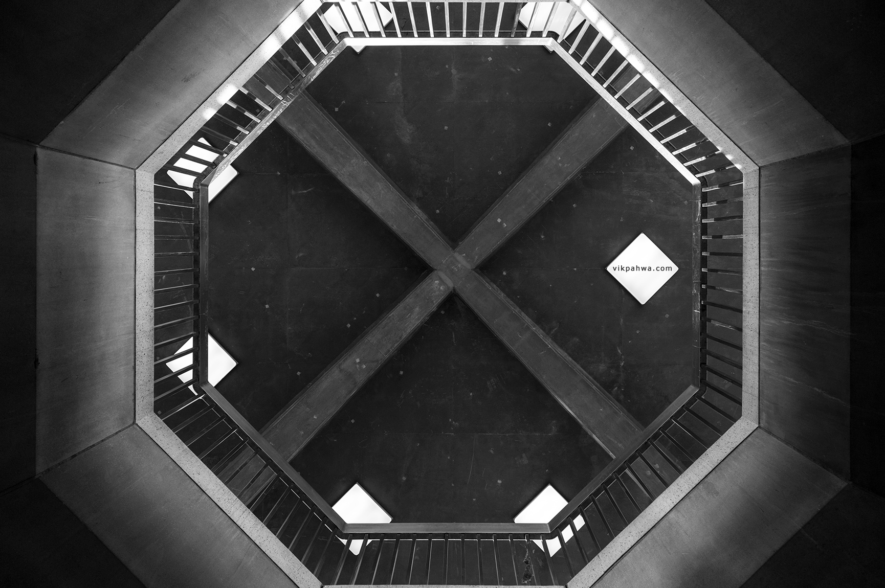
20160508. Octogon X. Minimal Aesthetic 89.
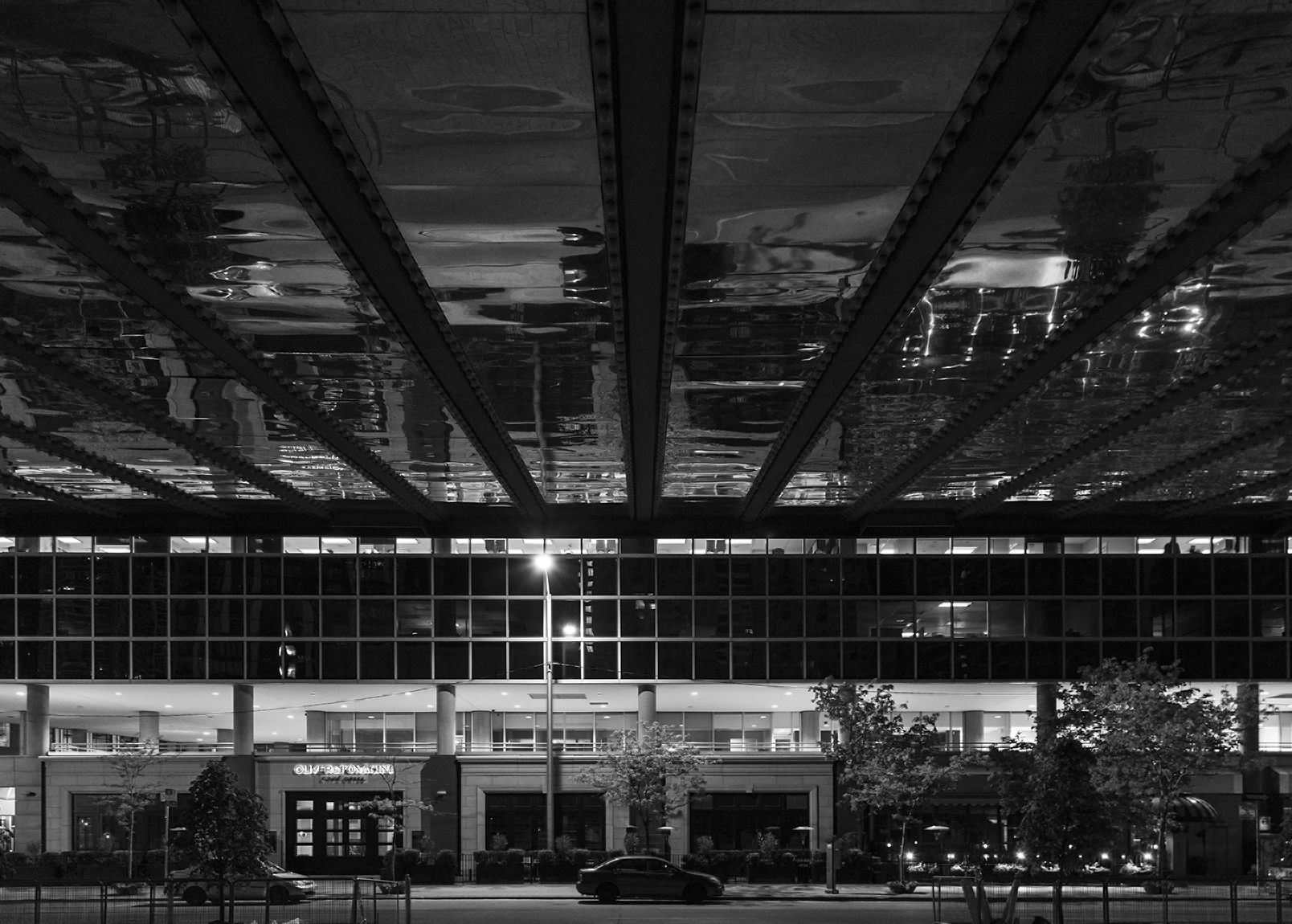
20160507. A rippled reflection in a grand canopy of the street in front of me.
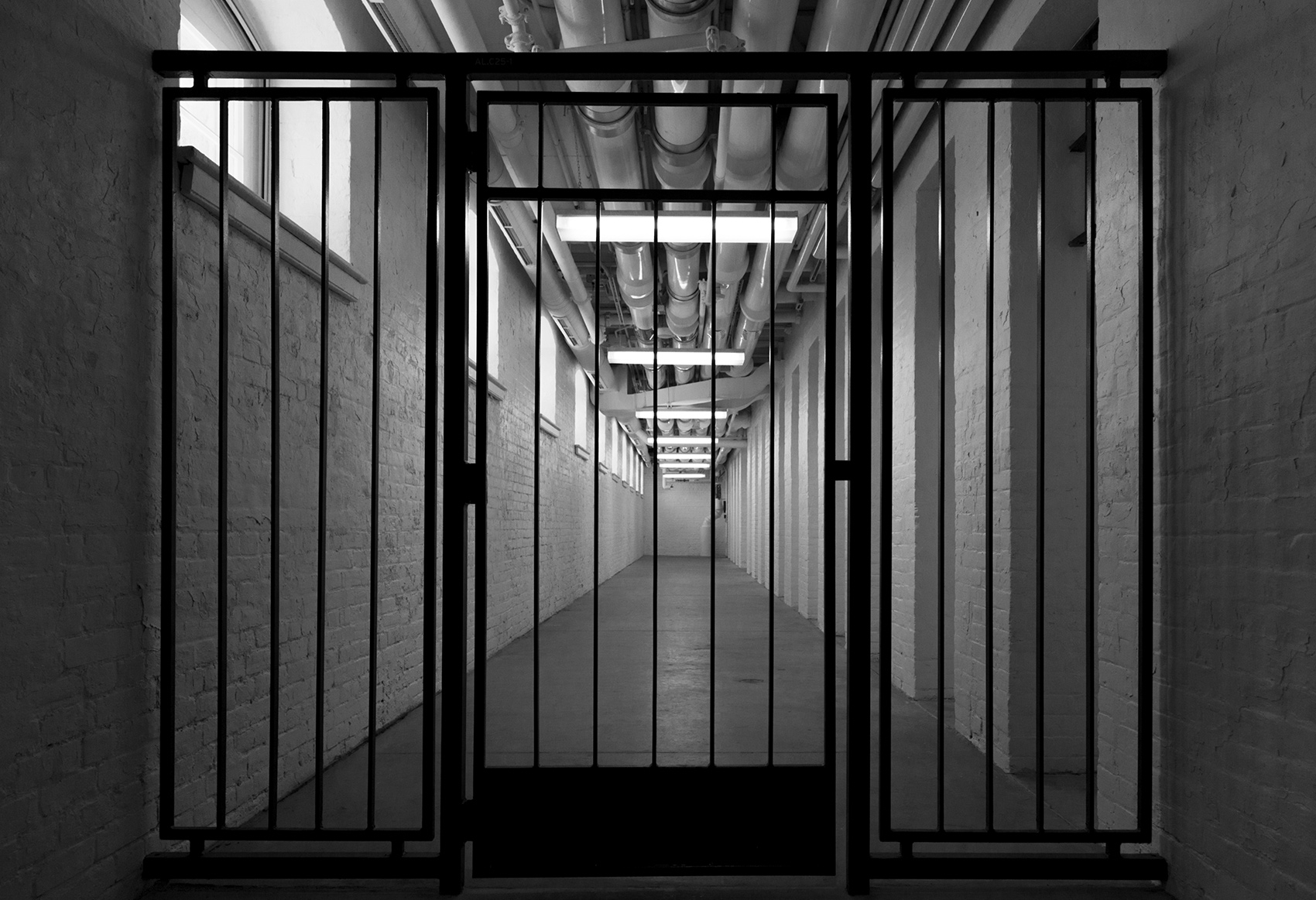
20160506. Experience going to prison at the Old Don Jail and current Bridgepoint Administration Building during Doors Open Toronto.
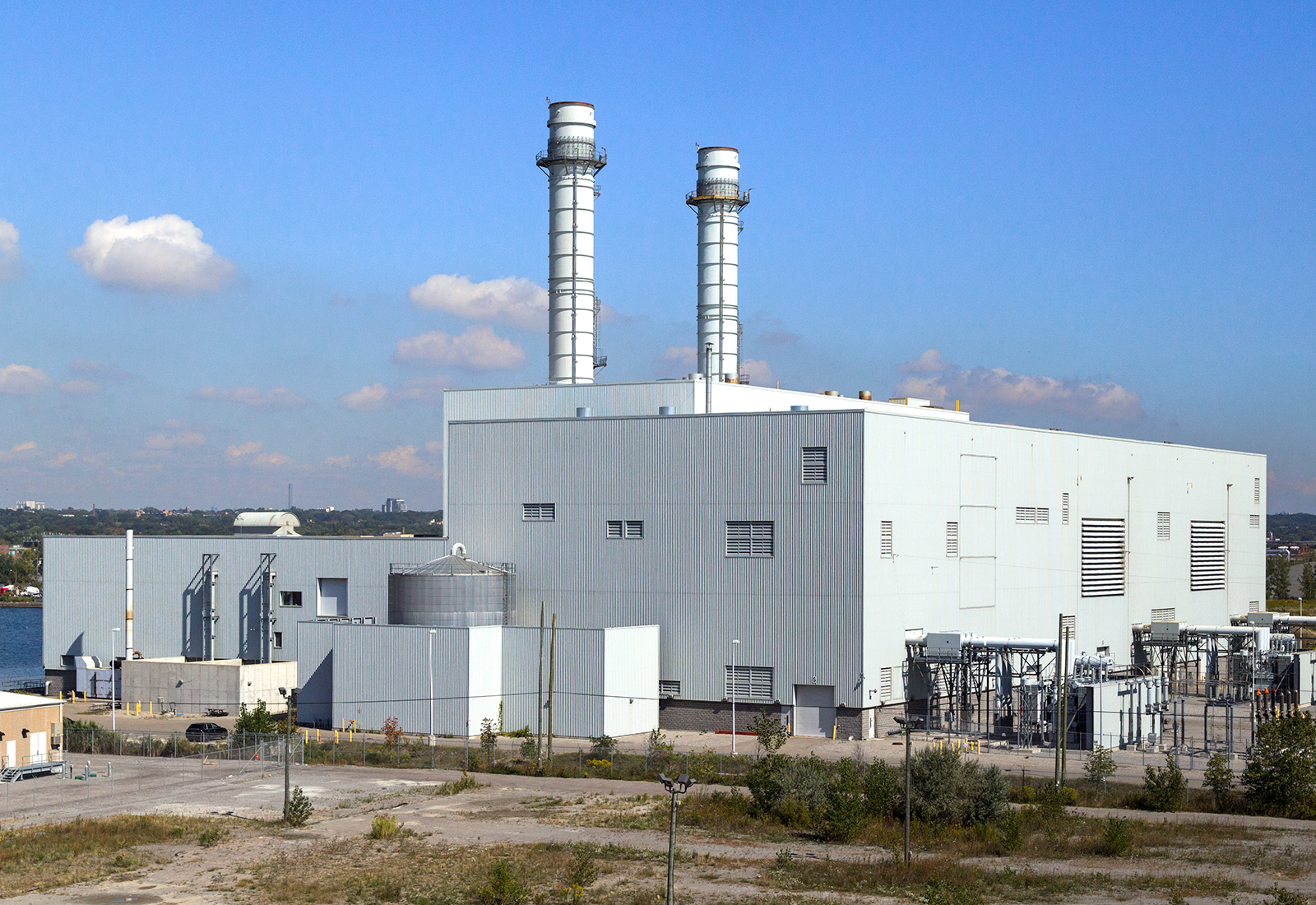
20160505. Go visit the Portlands Energy Centre during Doors Open Toronto!
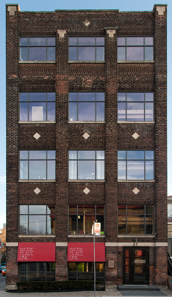
20160504. Beauty in a brick and beam building near Bathurst St in Toronto.
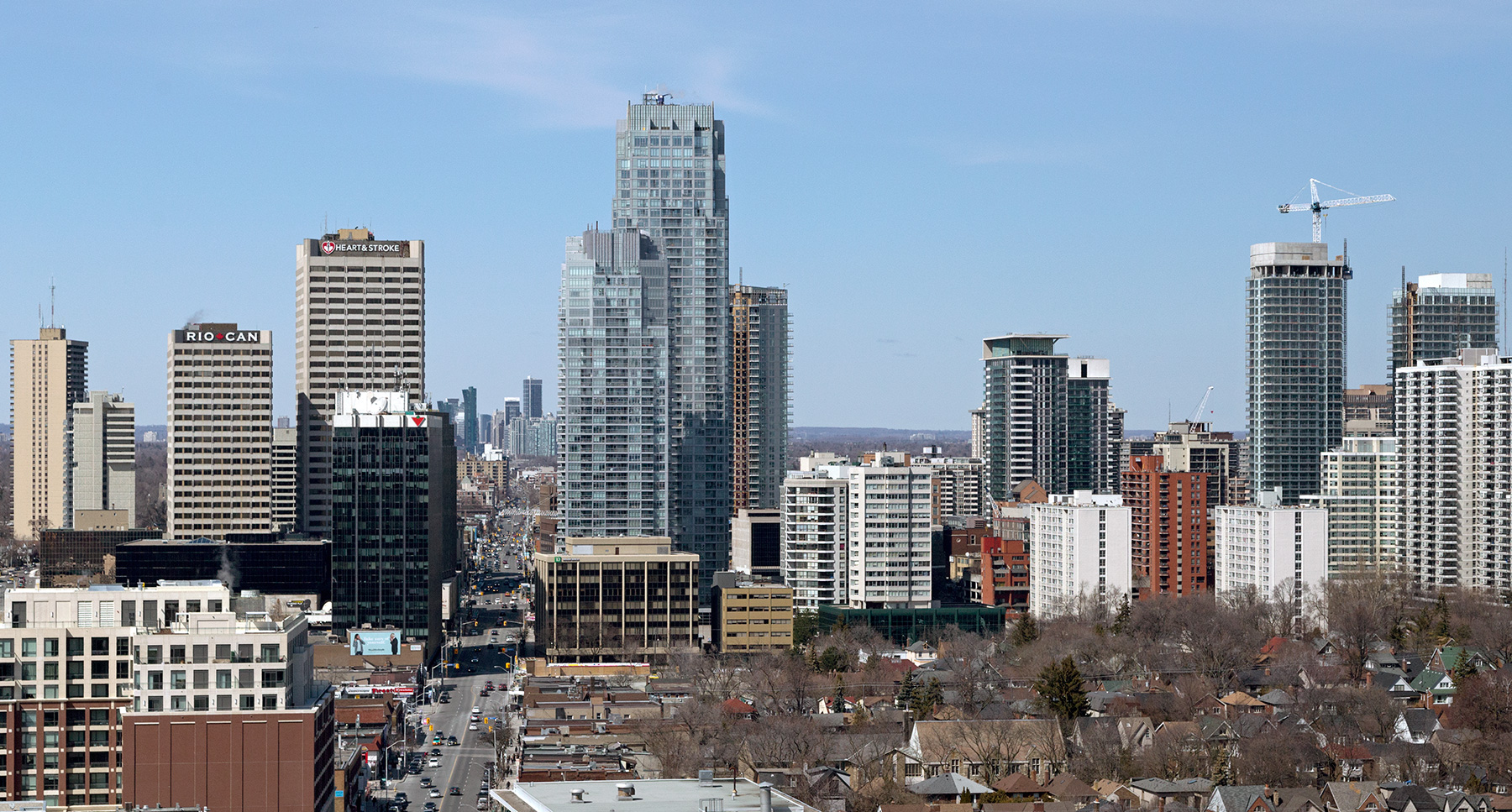
20160503. Toronto’s Yonge and Eglinton skyline continues to rise (looking north along Yonge Street).
20160502. TTC’s Davisville substation buildings provide a fine example of contextual design in shape, orientation and detailing.
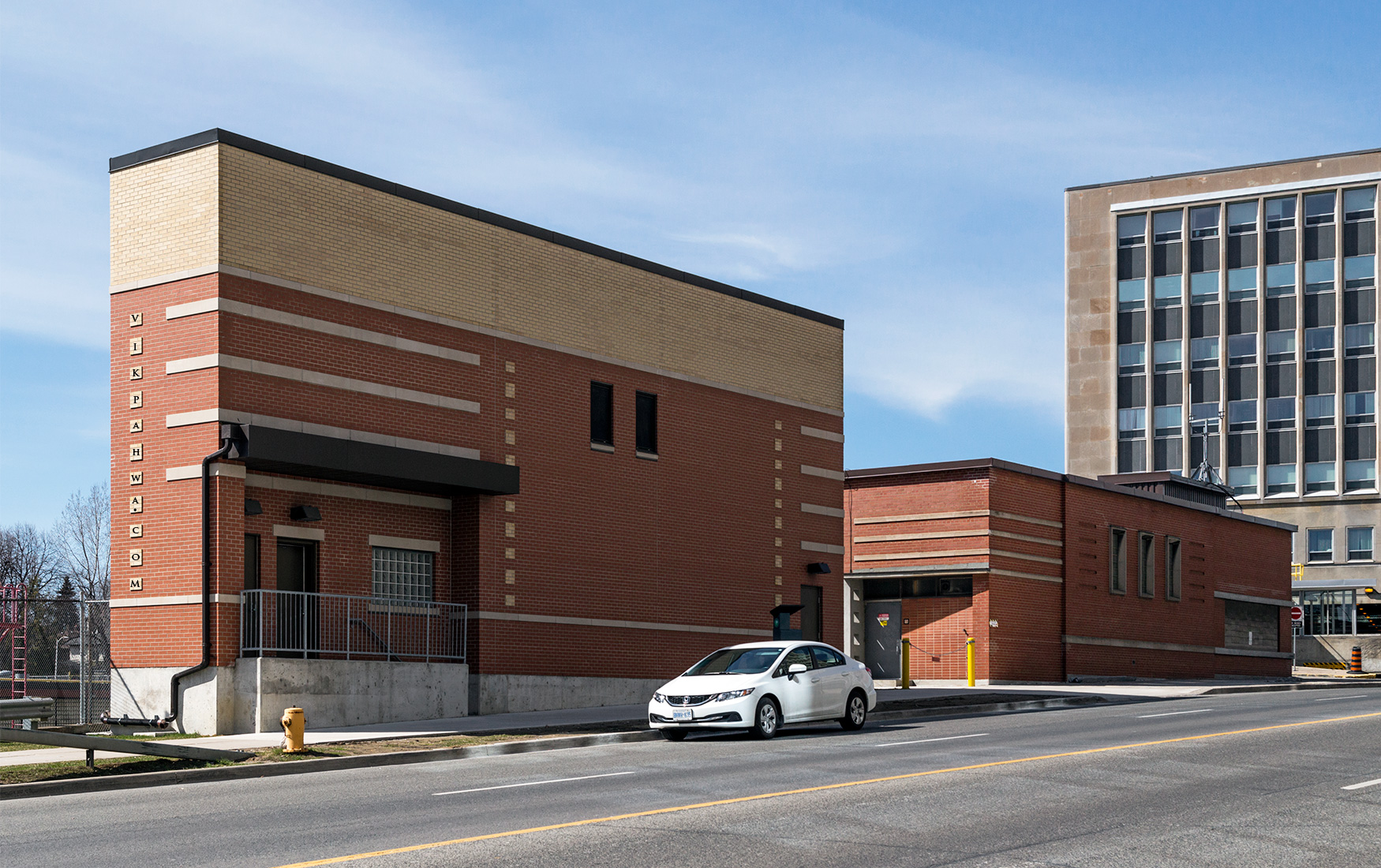 Pardoning the architectural nomenclature, note:
a) how the base course on each building (the stone band running the length of the building) is at the same height;
b) the cornice of the newer building is at the same height of the older building with the additional height of the former in a different colour
c) the masonry is similar in colour and the stone bands equal in number
d) the windows are similar; and
e) although hard to see, the older building and the newer building are each trapezoidal in shape and both buildings fit into a combined trapezoid.
The result is a simple yet elegant addition to a historical building.
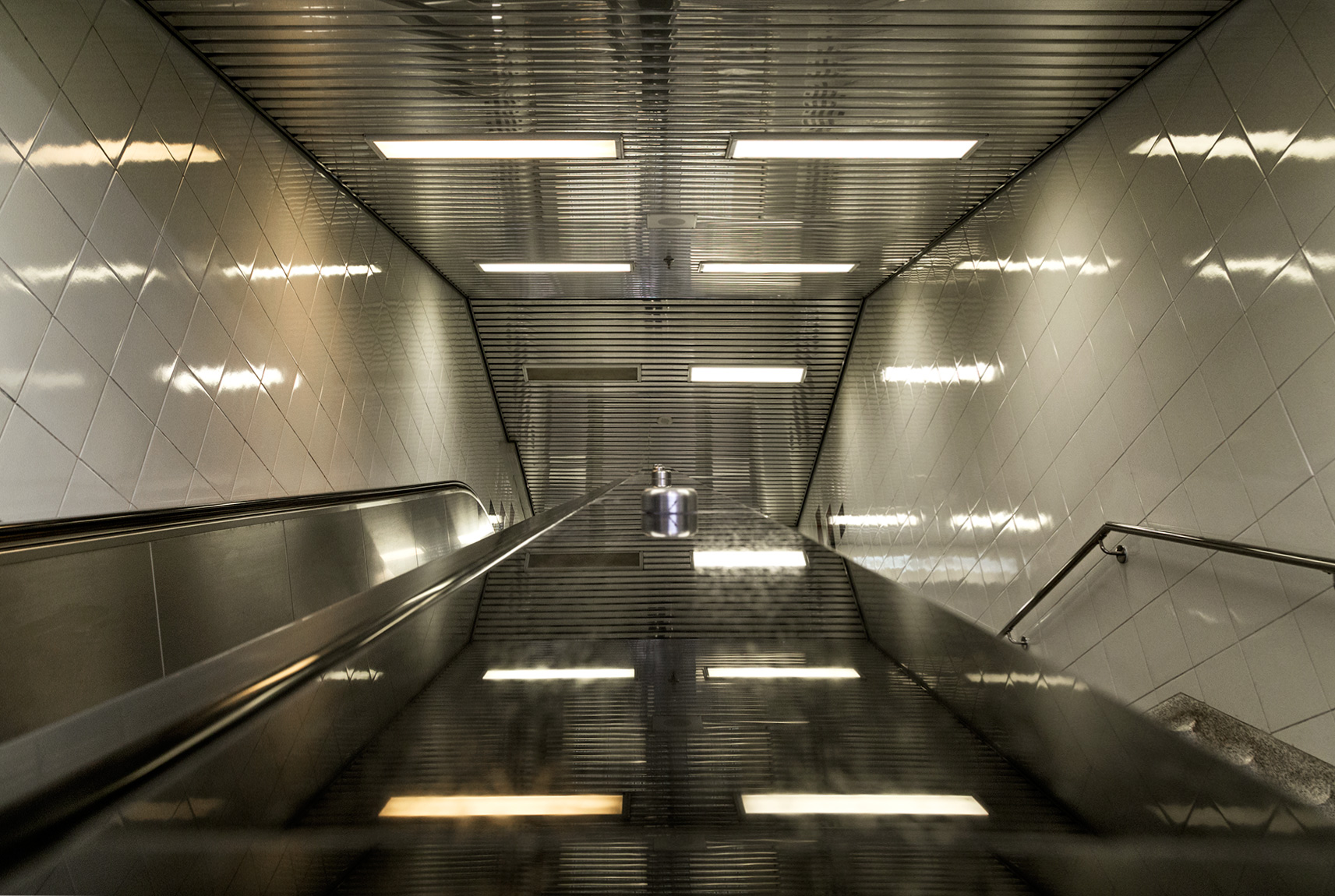
20160501. A shiny and just like new TTC automated entrance way. Can you guess which subway station?
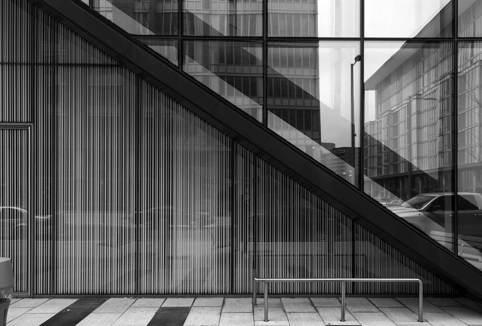
20160429. Birds need not fret the fritted glass at the newest George Brown College residence.
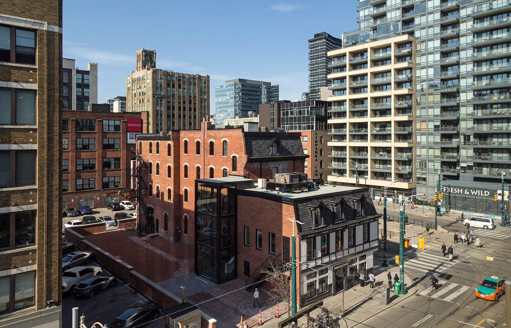
20160427. Taking a Quantum Coffee leap at the Brainstation below.
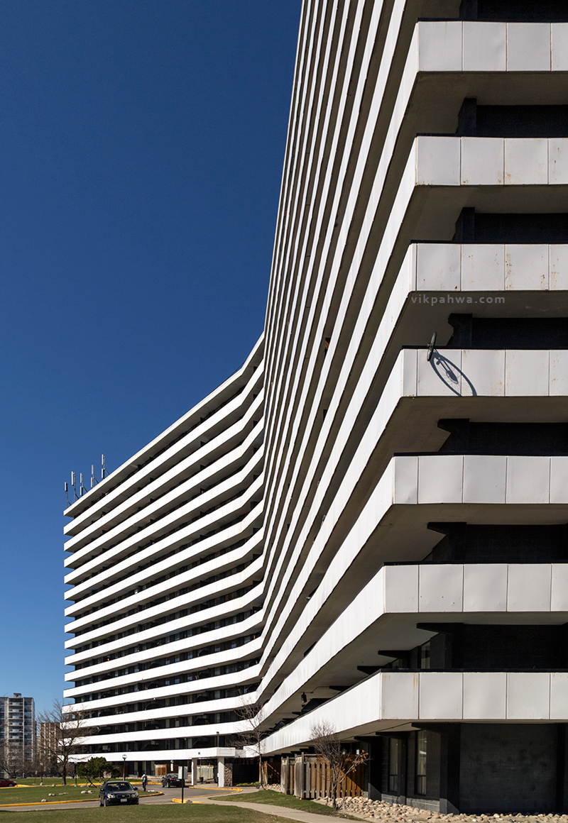
20160423. A long view on an unmistakably modern Toronto apartment building.
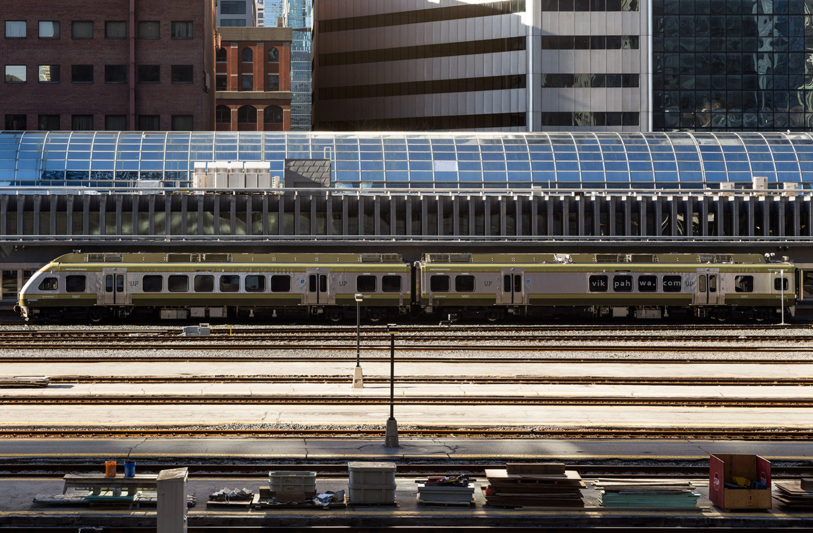
20160422. Toronto’s Union Pearson Express, busier and cheaper than ever, is ready to take off from downtown.
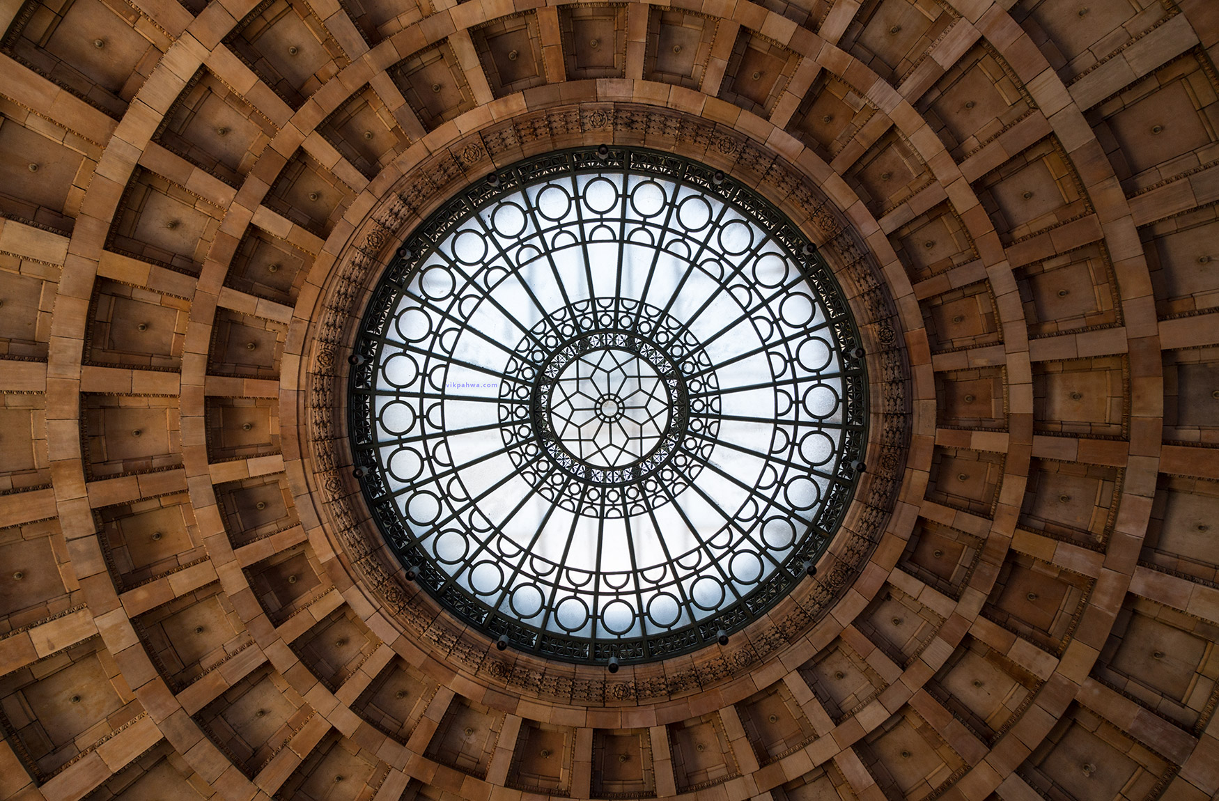
20160421. The spectacular skylight and ceiling of the remarkable rotunda at Pittsburgh Union Station, now the Pennsylvanian residences.
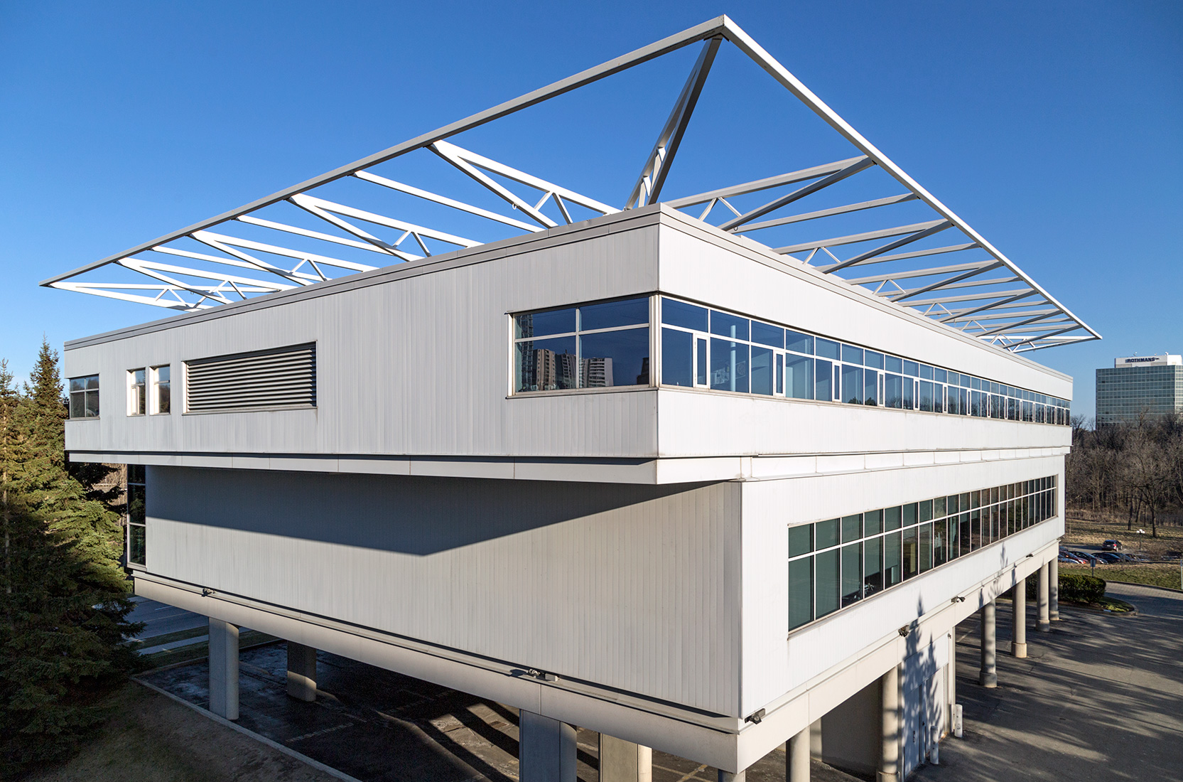
20160420. A rear view of the Ontario Association of Architects Headquarters (Architect Ruth Cawker, 1992).
