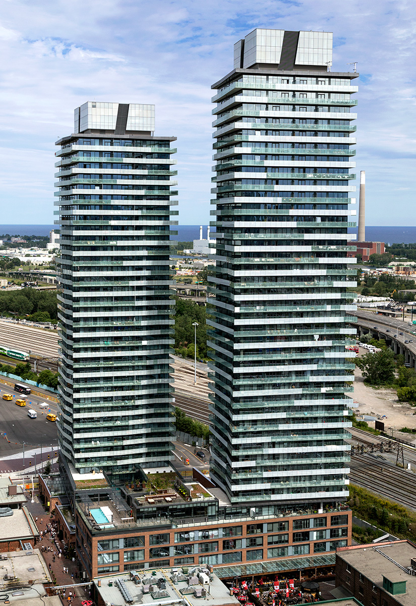
20150814. An aerial view of Toronto’s newest Distillery District Condos (Gooderham and Clear Spirit).
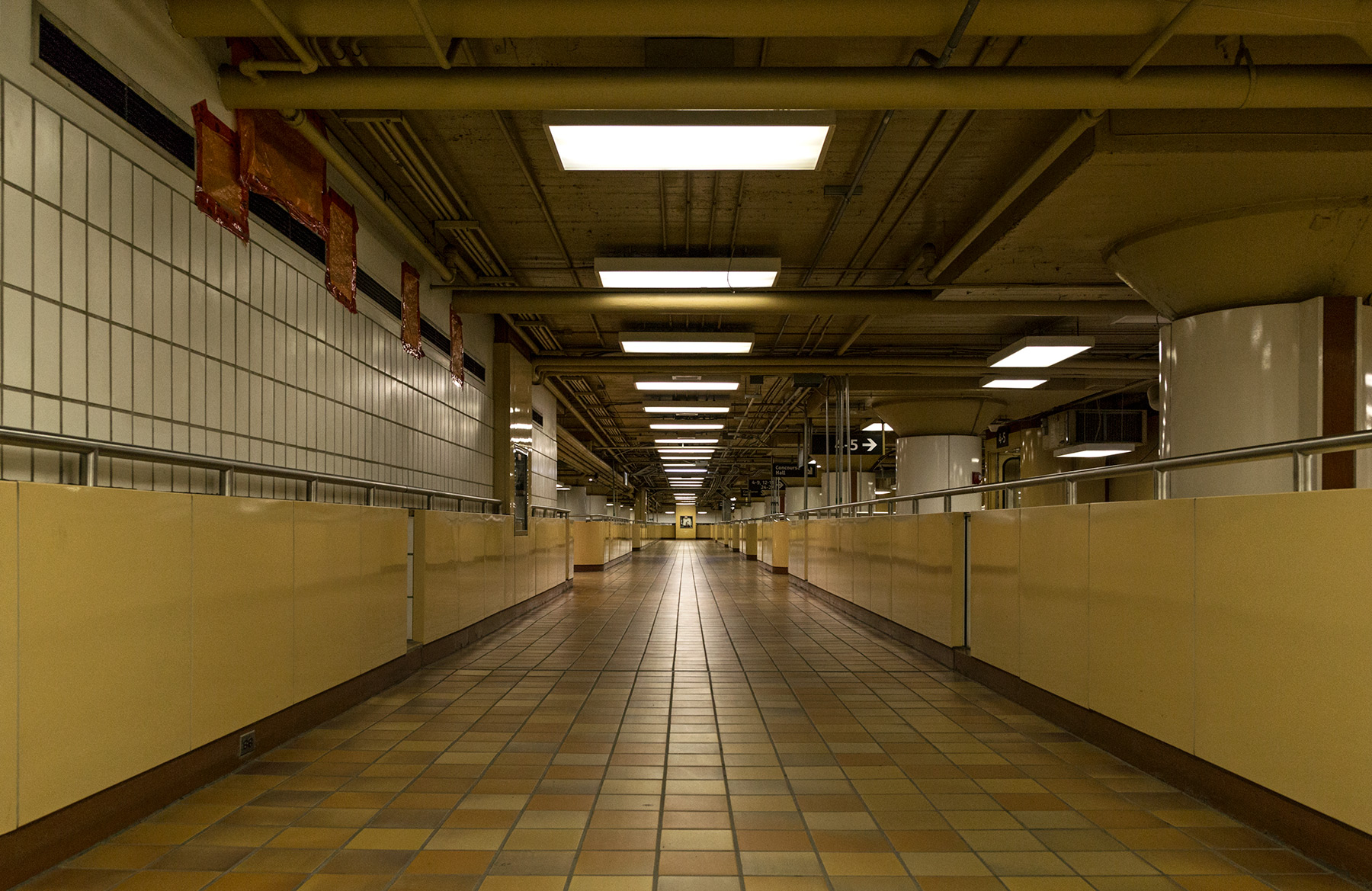
20150812. A conduit for commuters and an empty gangway of lights at Toronto’s closing GO Transit Bay Concourse.
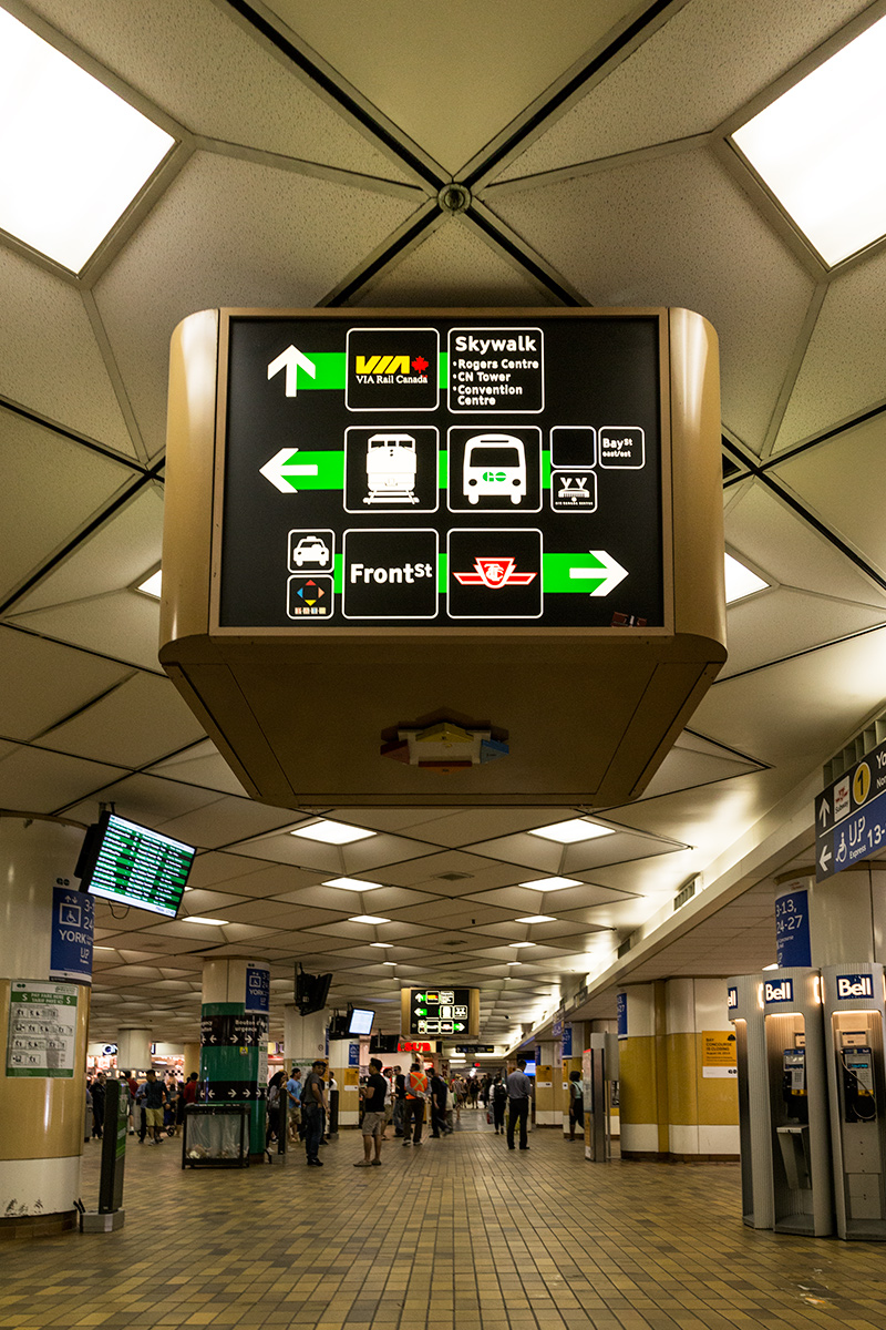
20150811. The fancy drop ceilings and old school way-finding signage are history at Toronto’s Union Station GO Transit Bay Concourse.
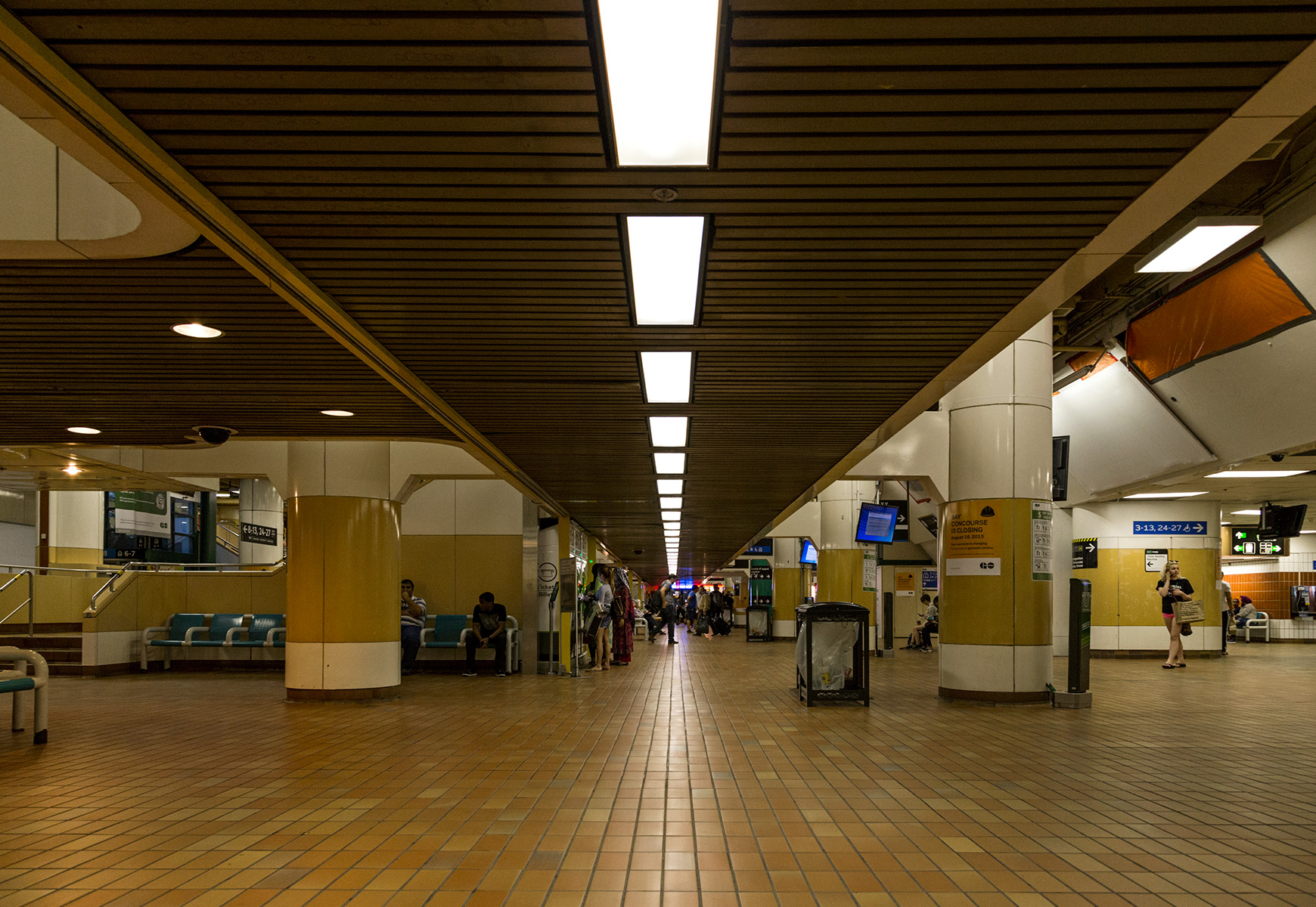
20150810. Fluorescent lights span Toronto’s Union Station GO Transit Bay Concourse, closing for renovations after 37 years.
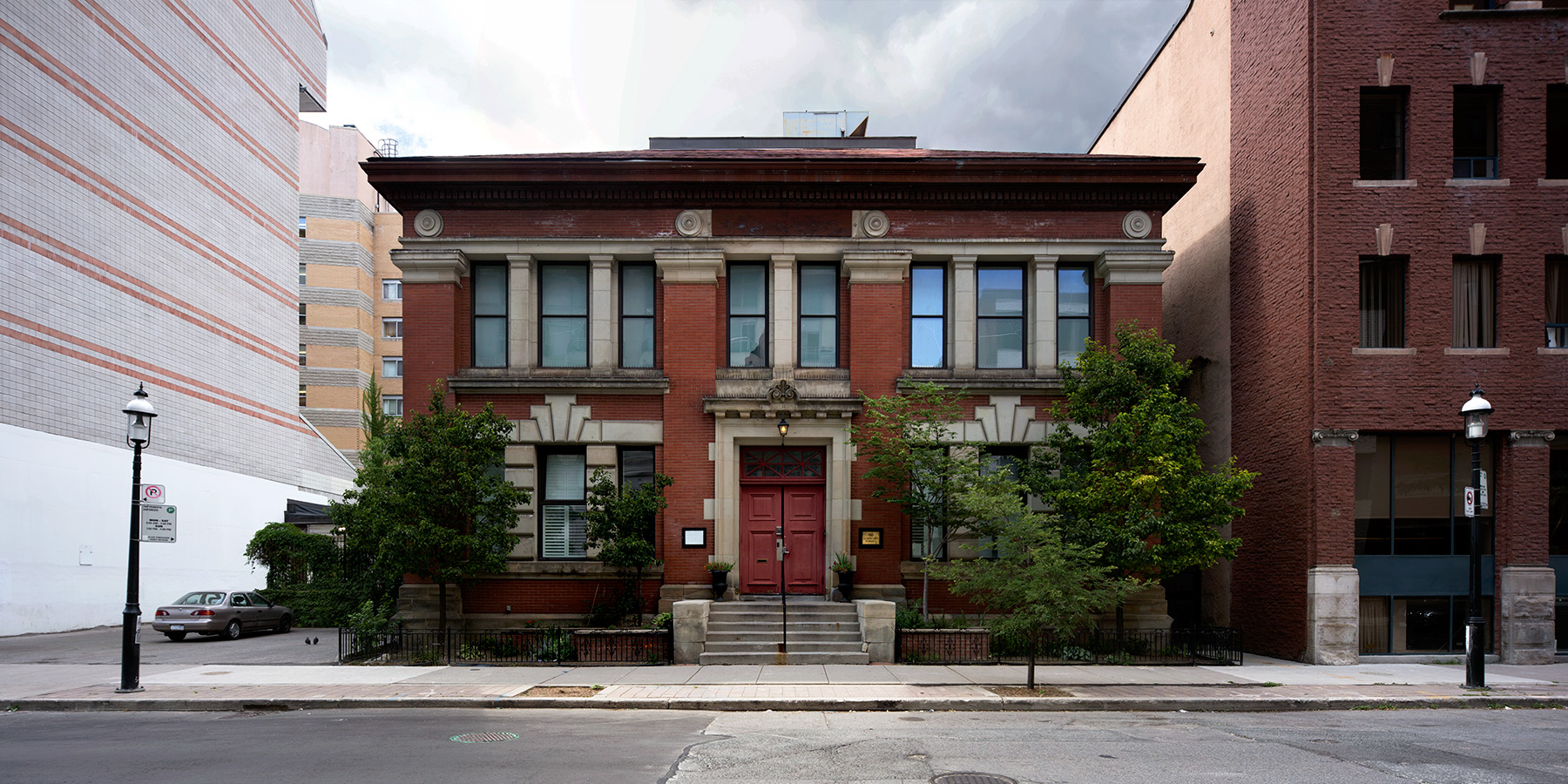
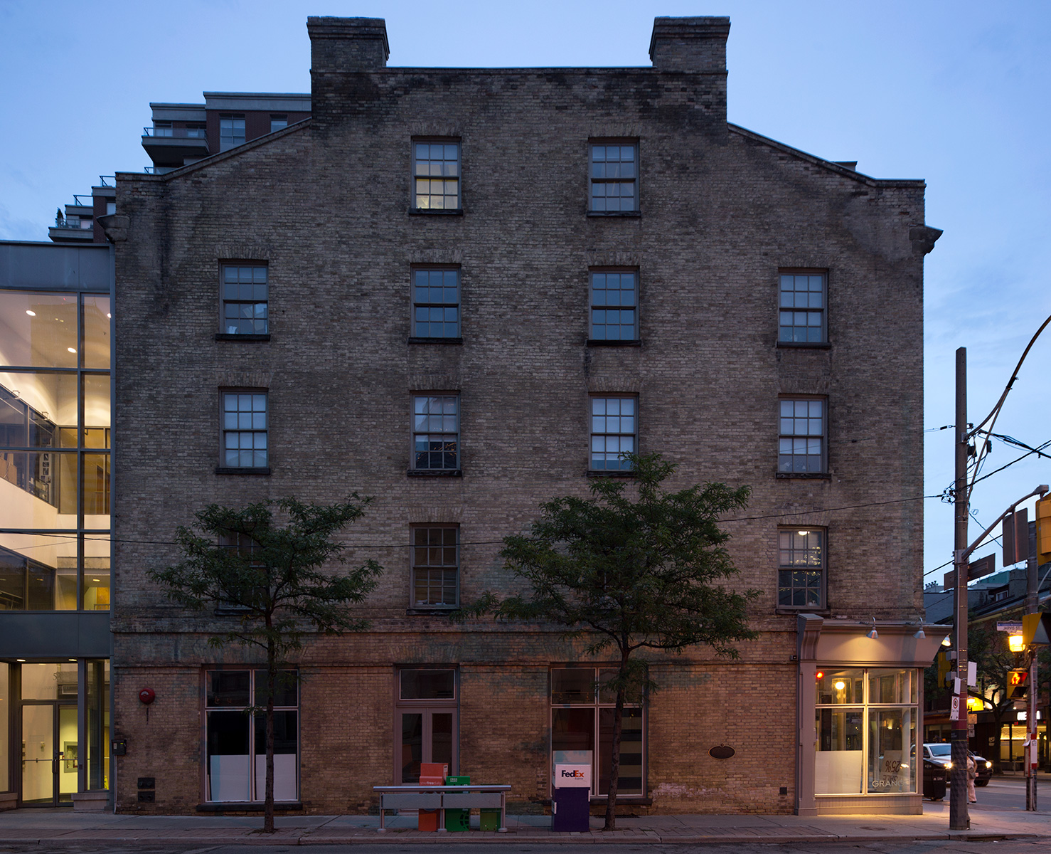
A west elevation of the 1833 Georgian Daniel Brooke building in Old Town Toronto.
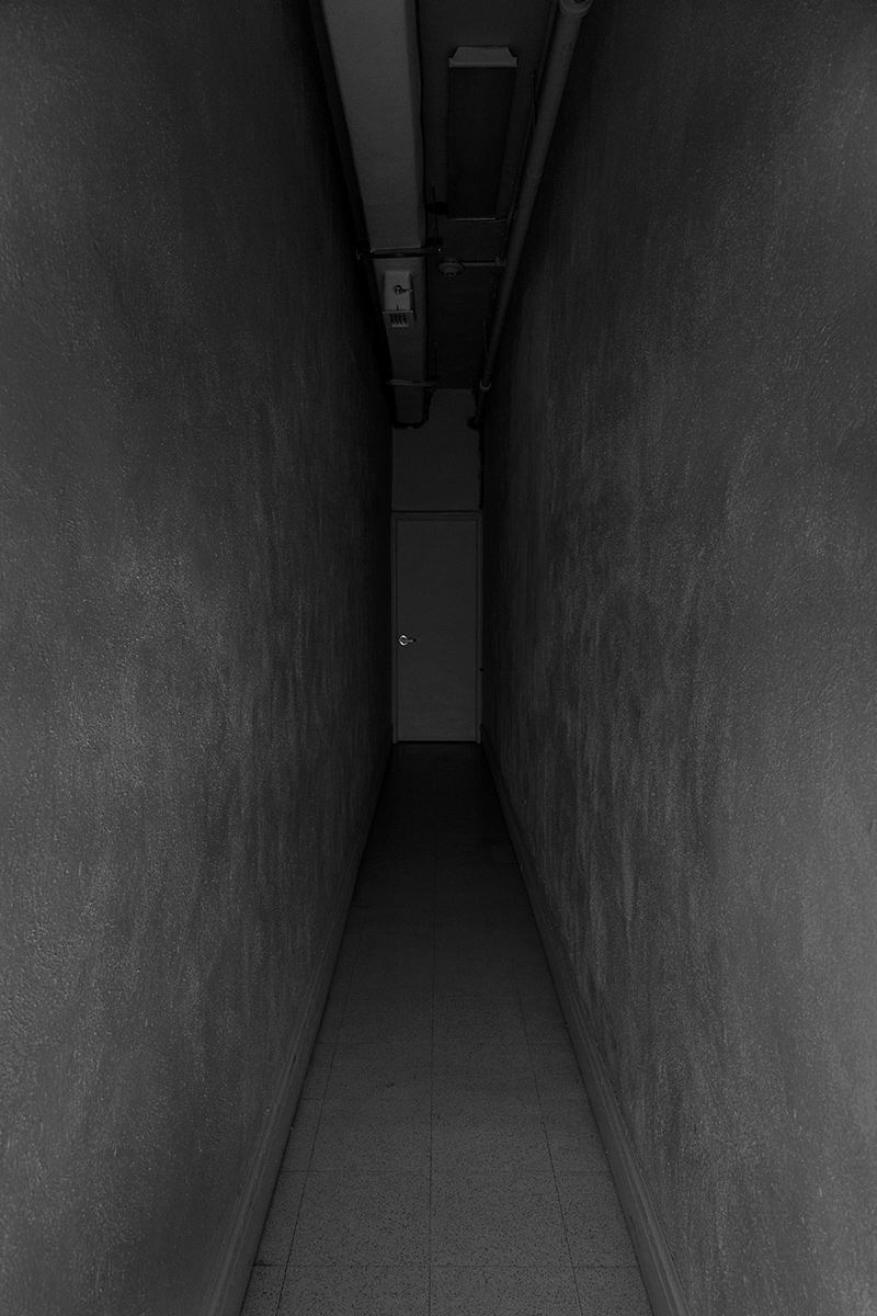
20150808. What lies beyond this dark incapacious corridor? Minimal Aesthetic 63.
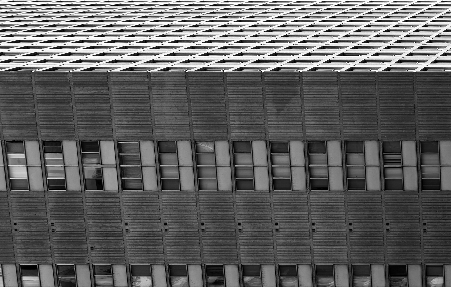
20150807. What it looks like when falling sideways from the top of a tall 1979 International style concrete residential tower.
20150806. Toronto’s Edwardian Classical 3 Church Street.

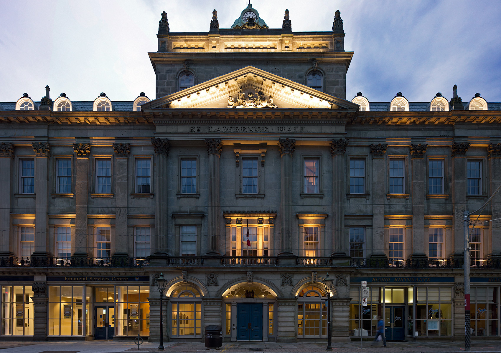
20150805. Toronto’s striking St. Lawrence Hall (1851, Renaissance Revival) and home of Heritage Toronto.
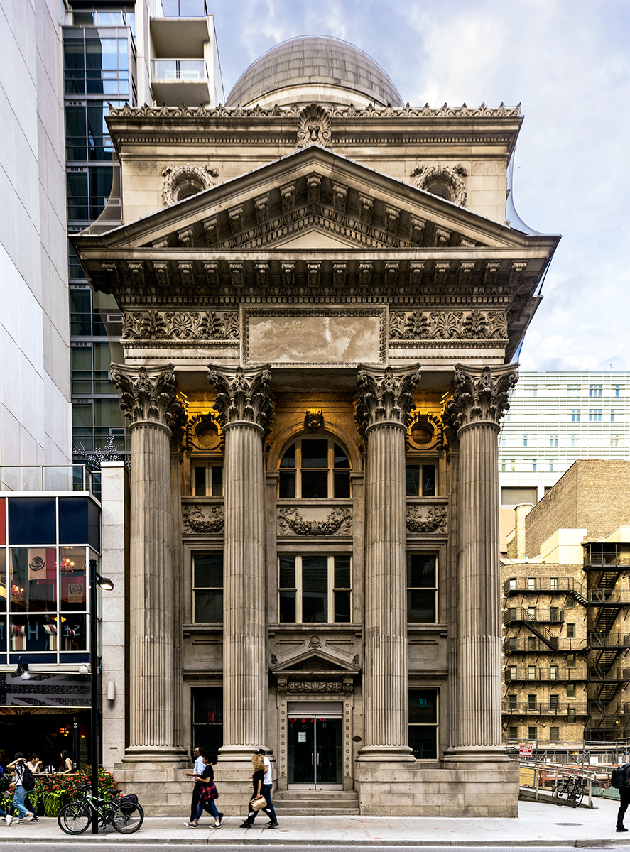
20150804. Toronto’s stunning Bank of Toronto building (c.1906, Architect EJ Lennox, Classical Revival style).
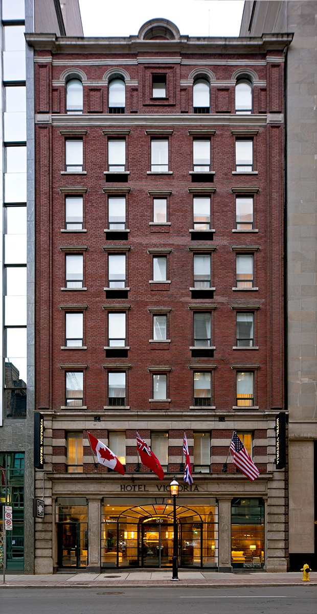
20150803. Toronto’s boutique Hotel Victoria (c.1909, James Patrick Hynes), the first fireproof building in Toronto with the first foundation extending down to bedrock.
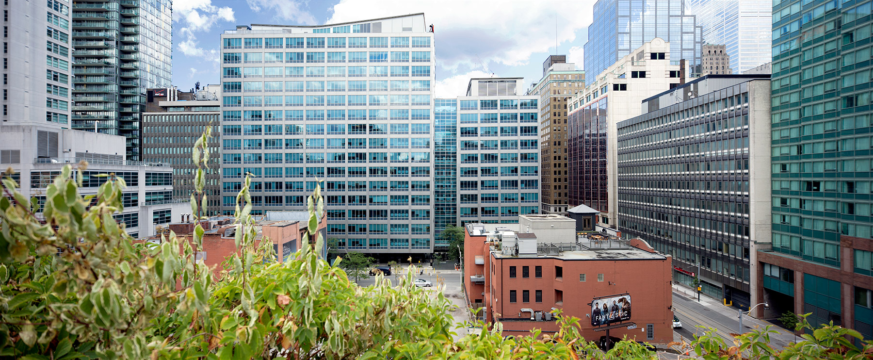
20150802. An elevated wide-angle view of Toronto’s State Street Financial Centre soon to be obstructed by a pair of condominium towers.
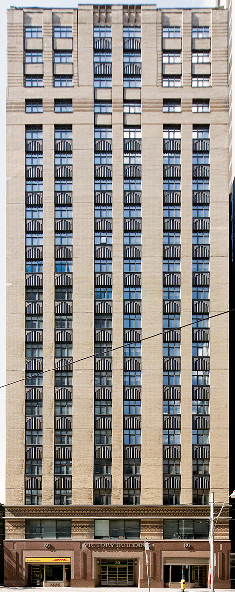
20150801. A full-length view of Toronto’s art deco Victory Building (c.1930, Baldwin and Greene, 80m), Canada’s first fully air-conditioned building.
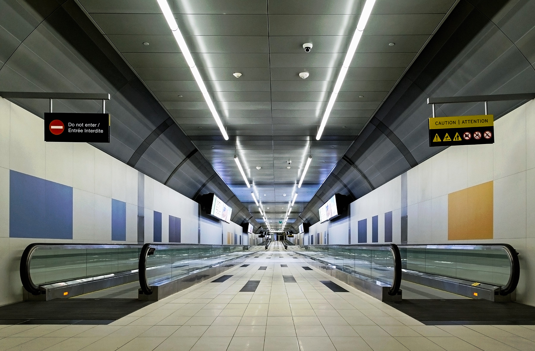
20150731. Toronto’s new Billy Bishop Island Airport 853 ft pedestrian tunnel runs 100 ft beneath the surface of the lake.
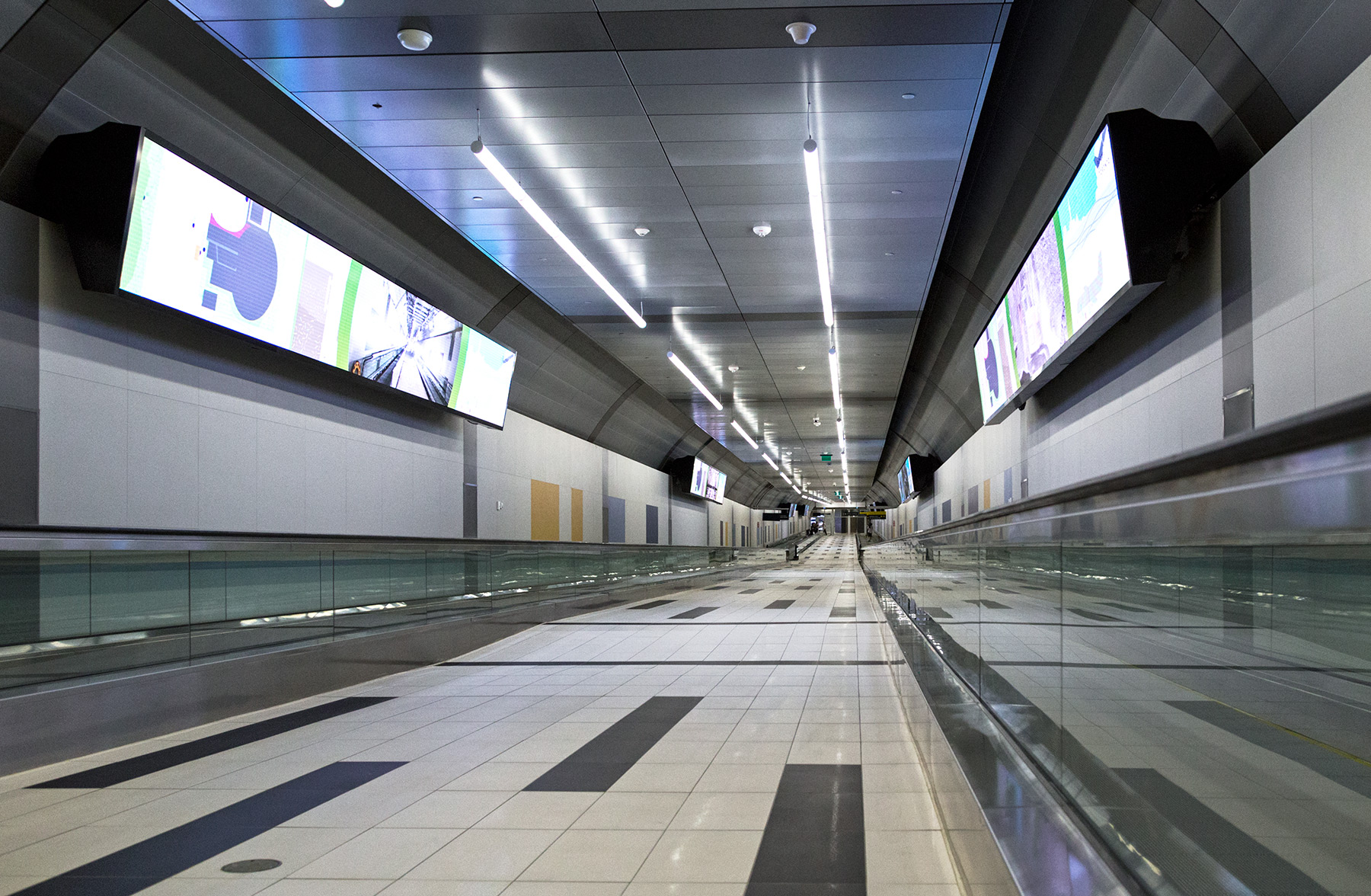
20150730. Toronto’s Billy Bishop Island Airport Pedestrian Tunnel is open!
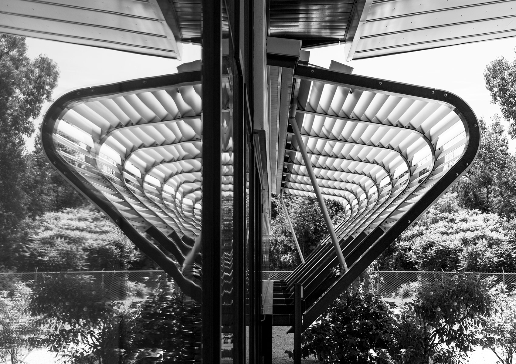
20150729. A sun-shading louvres reflection. UTIAS Microsatellite Science and Technology Centre, Toronto.
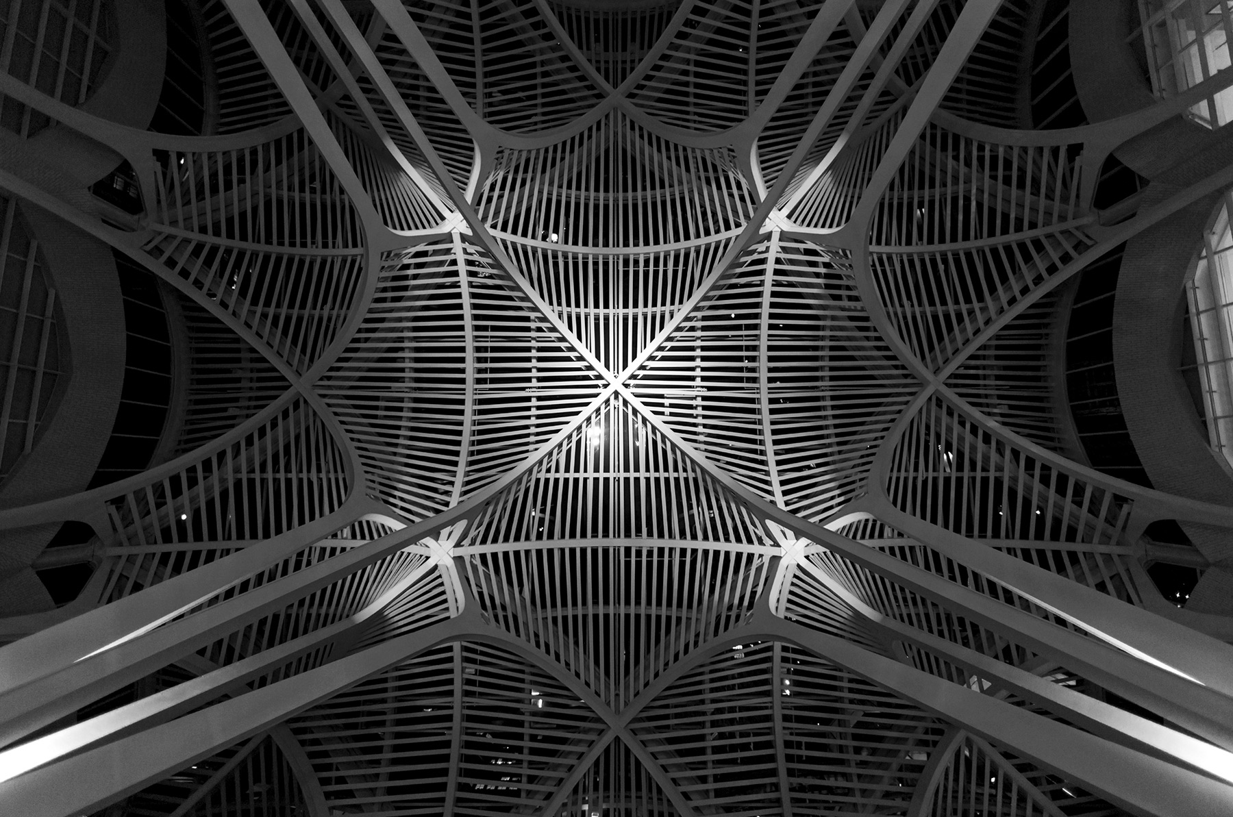
20150728. An intricate ceiling at Sam Pollock Square in Toronto’s Brookfield Place (Architect Santiago Calatrava, c.1992).
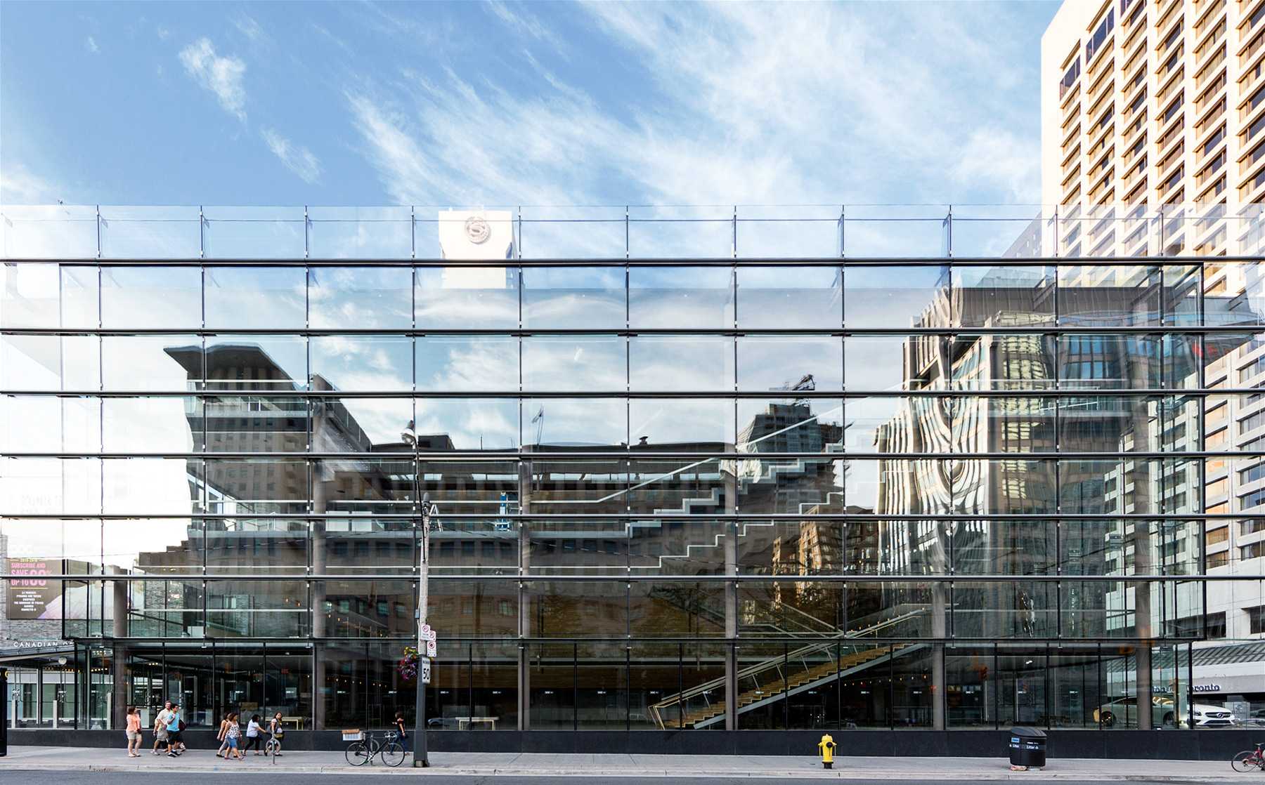
20150727. The transparent yet reflective glass curtain wall of Toronto’s Four Seasons Centre for the Performing Arts.
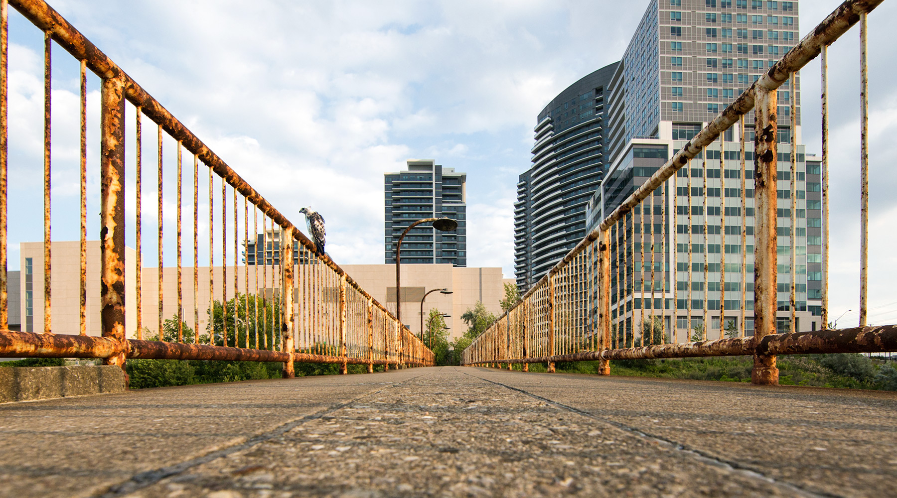
20150726. A Krider’s red-tailed hawk looks for prey on an abandoned rusty 53 year old pedestrian overpass in Thornhill.
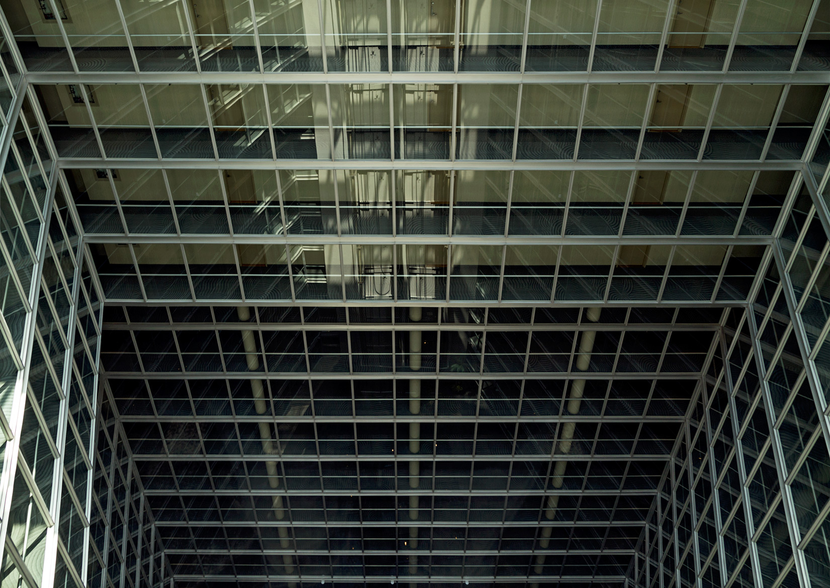
20150725. Looking down a 16 storey neomodern condominium atrium.
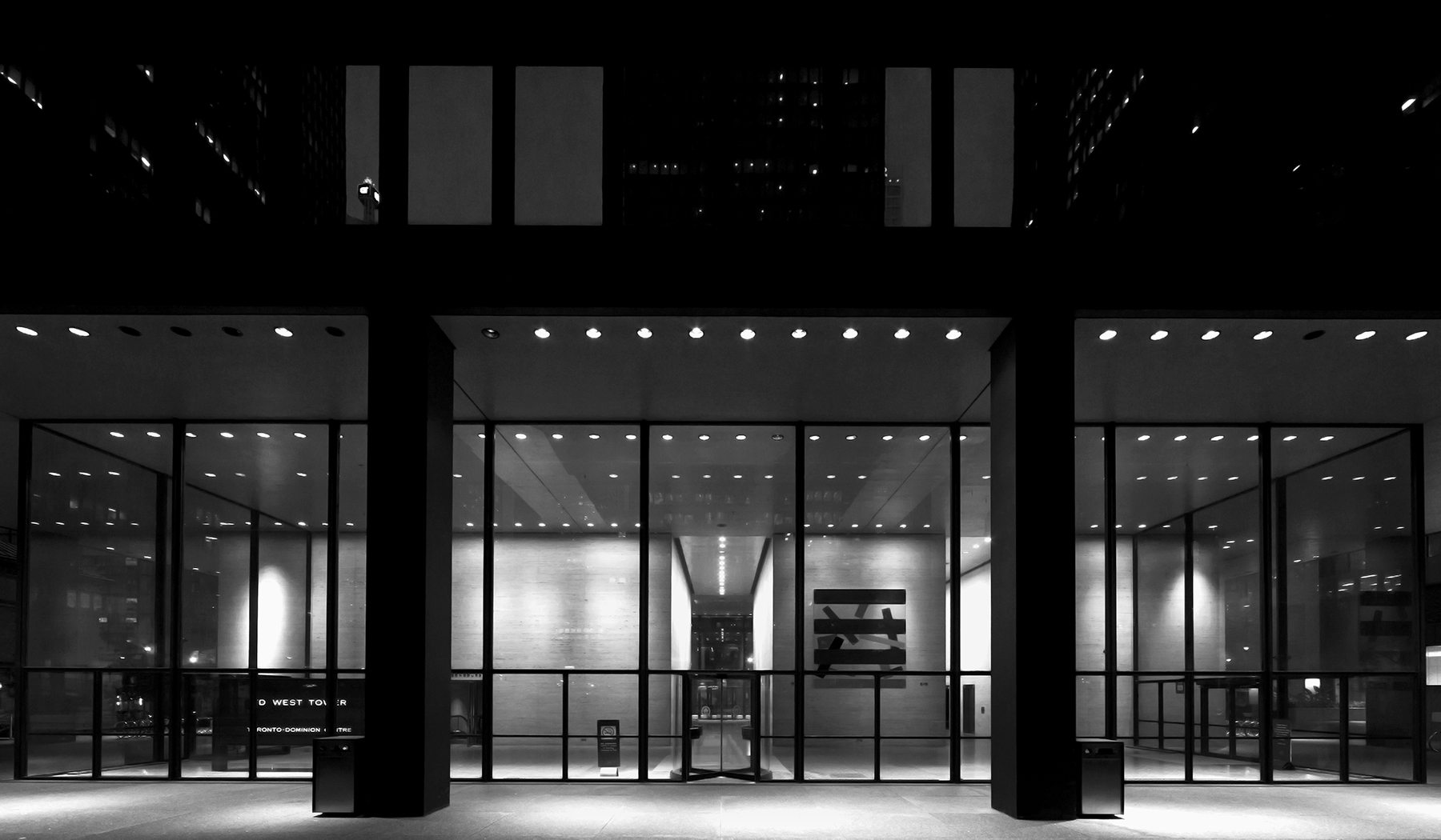
20150724. The inviting entrance to Toronto’s TD Centre West Tower, a Mies masterpiece.
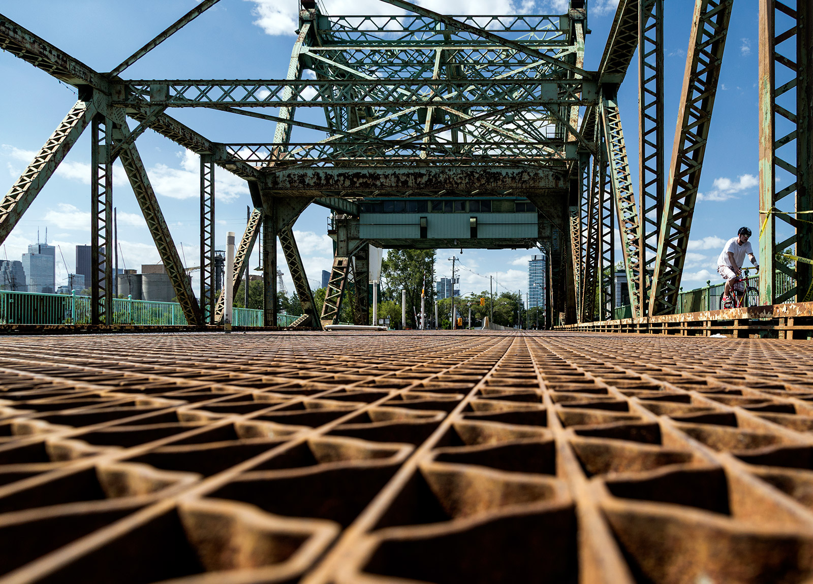
20150723. A deck level view of Toronto’s Cherry St Bascule Bridge.
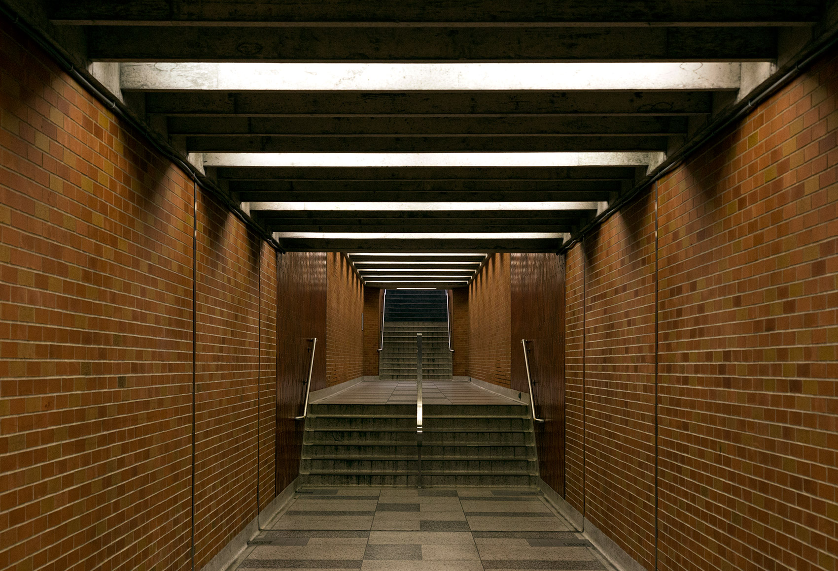
20150722. An appealing subterranean passageway at Toronto’s Wilson TTC subway station.
20150721. Toronto’s TTC York University busway threads its way through the Finch Hydro Corridor.

