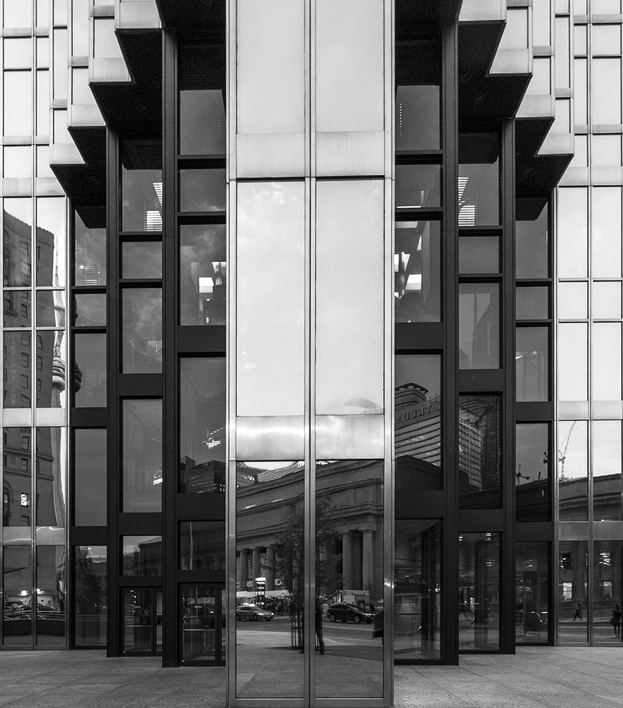
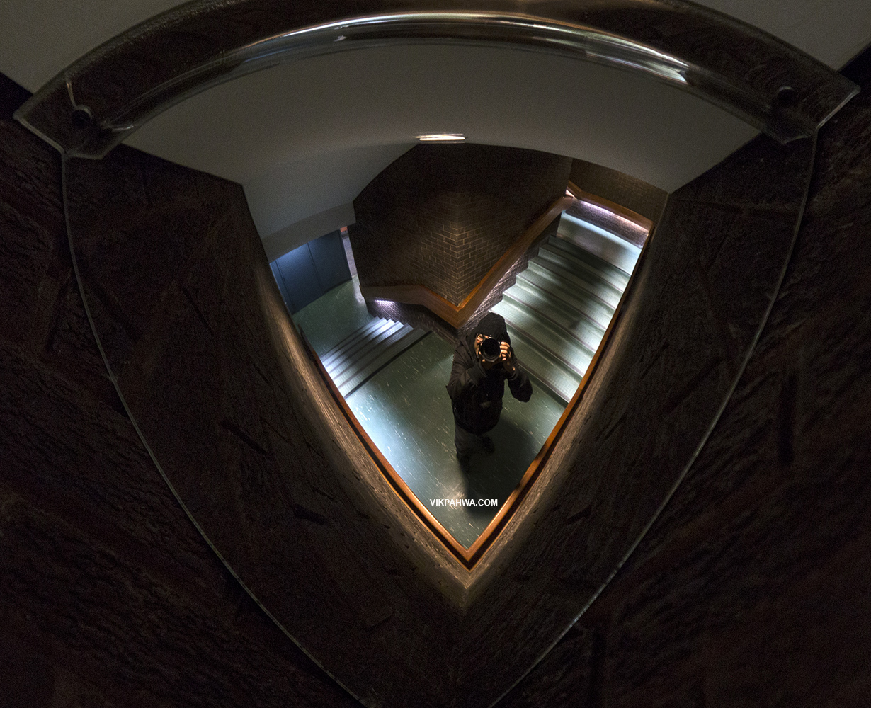
20170514. A quarter convex mirror self-reflection. Today marks the 6th anniversary of this daily toronto photo blog. Thanks for looking!
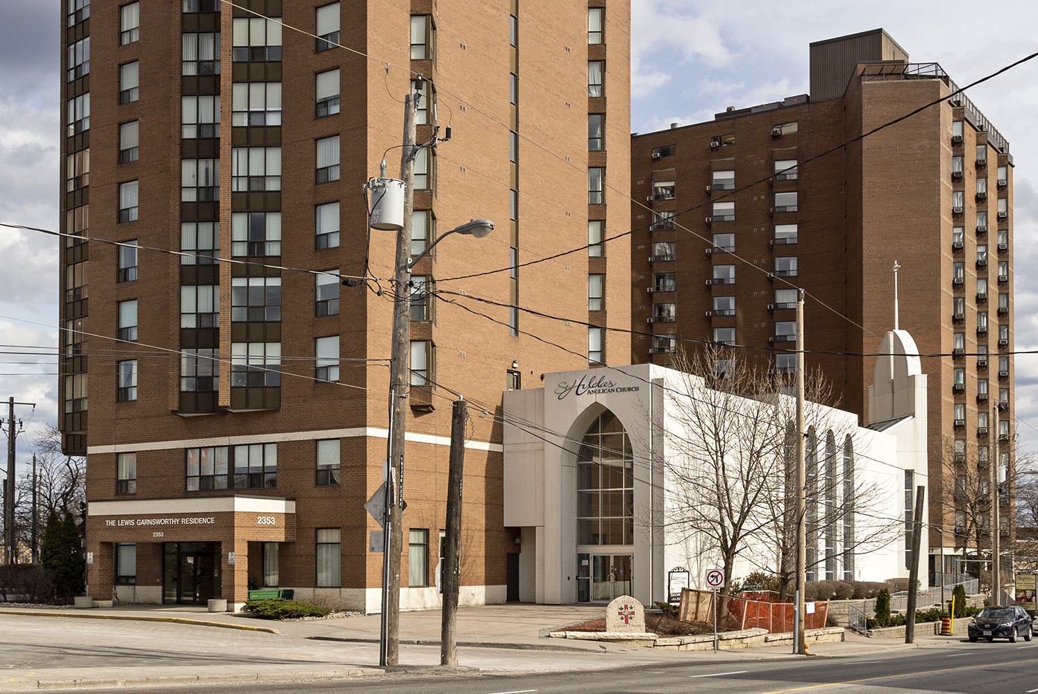
20170513. Get from modern home to postmodern church with a hop, skip and a jump at Dufferin and Eglinton.
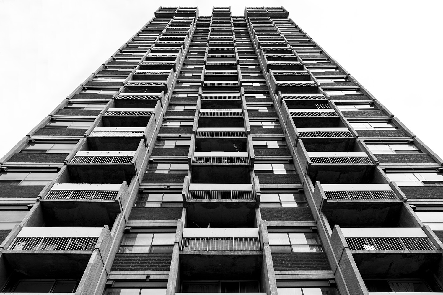
20170512. Living in brutalism at the Centrepoint East apartment complex in Moss Park.
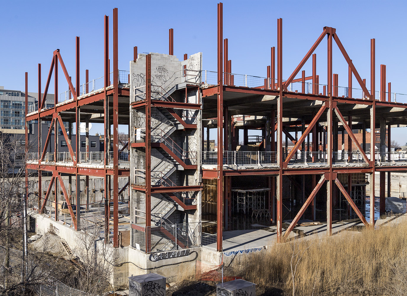
20170511. A temporary stairwell with a view soon to be swallowed up by Streetcar Developments’ Riverside Square.
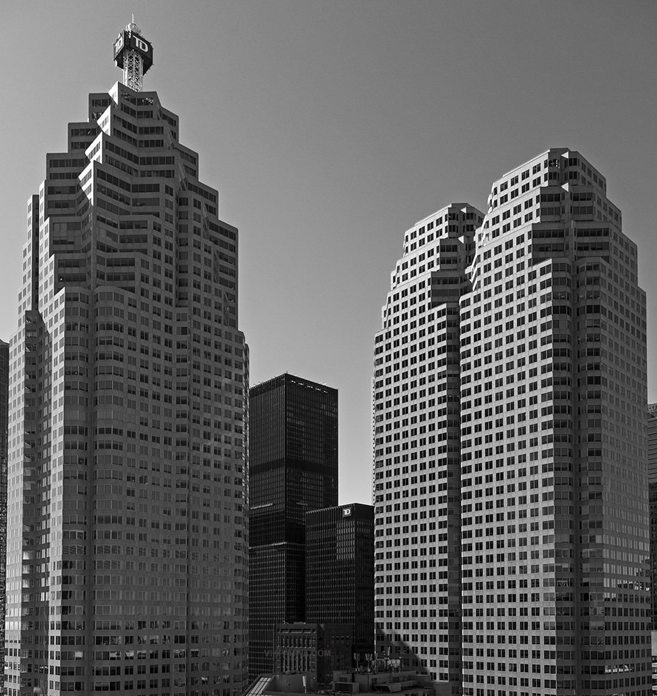
20170510. Brookfield Place vs. Toronto-Dominion Centre – a battle of skyscraper complexes sporting the TD Canada Trust logo.
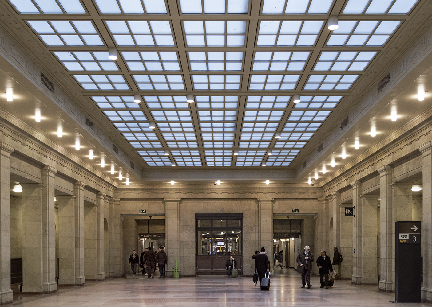
20170509. Under Union Station’s restored west wing skylight.
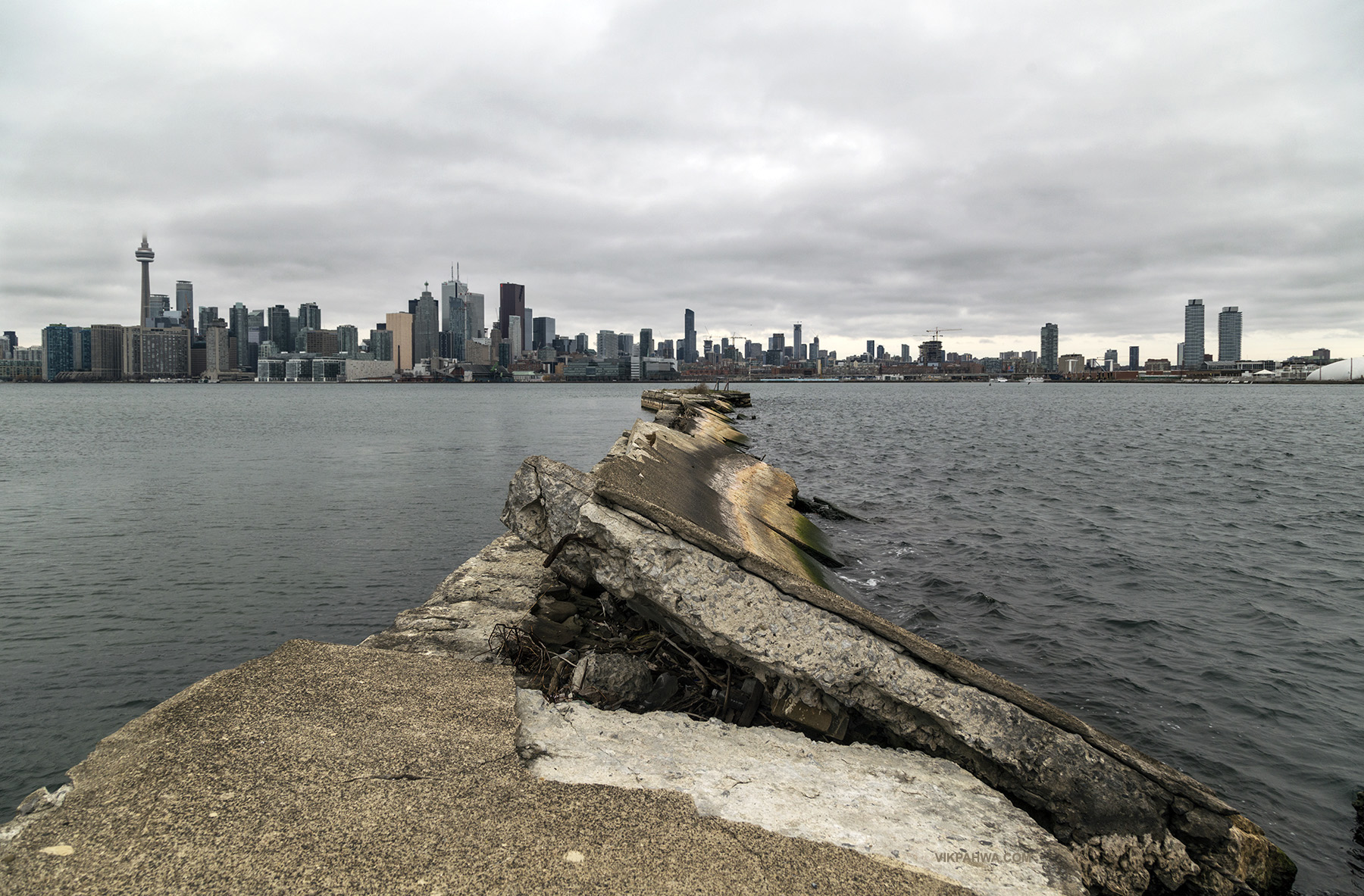
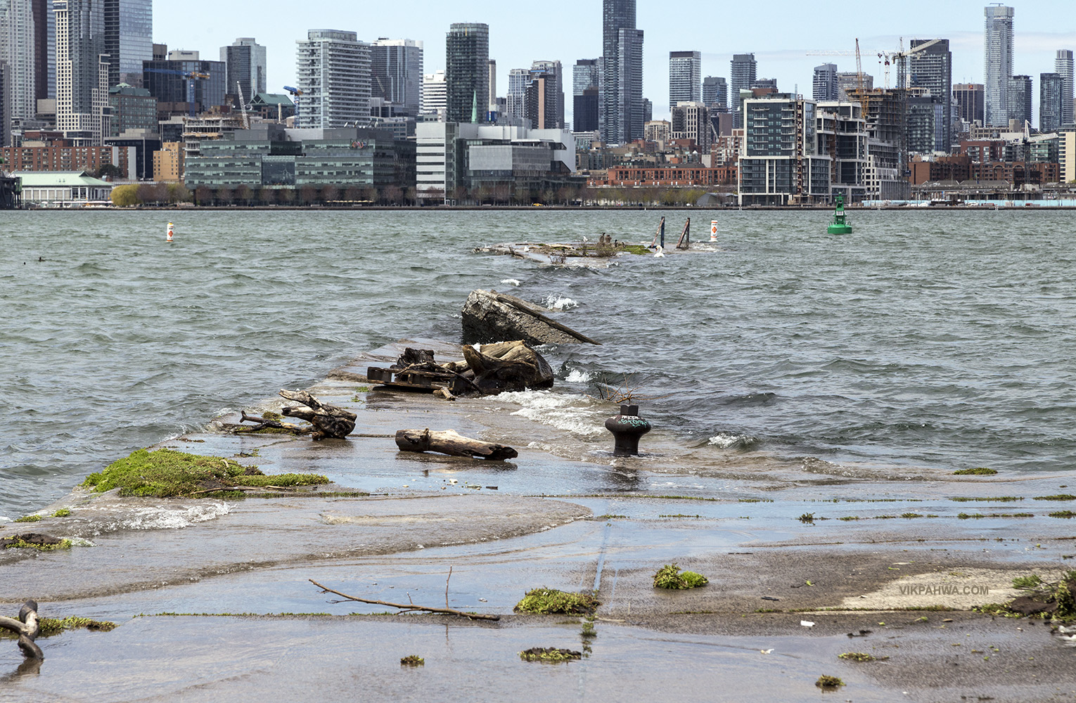
20170507. Then and now pictures of a derelict concrete pier on Ward’s Island illustrate how much Lake Ontario’s water level has increased over the past few days.
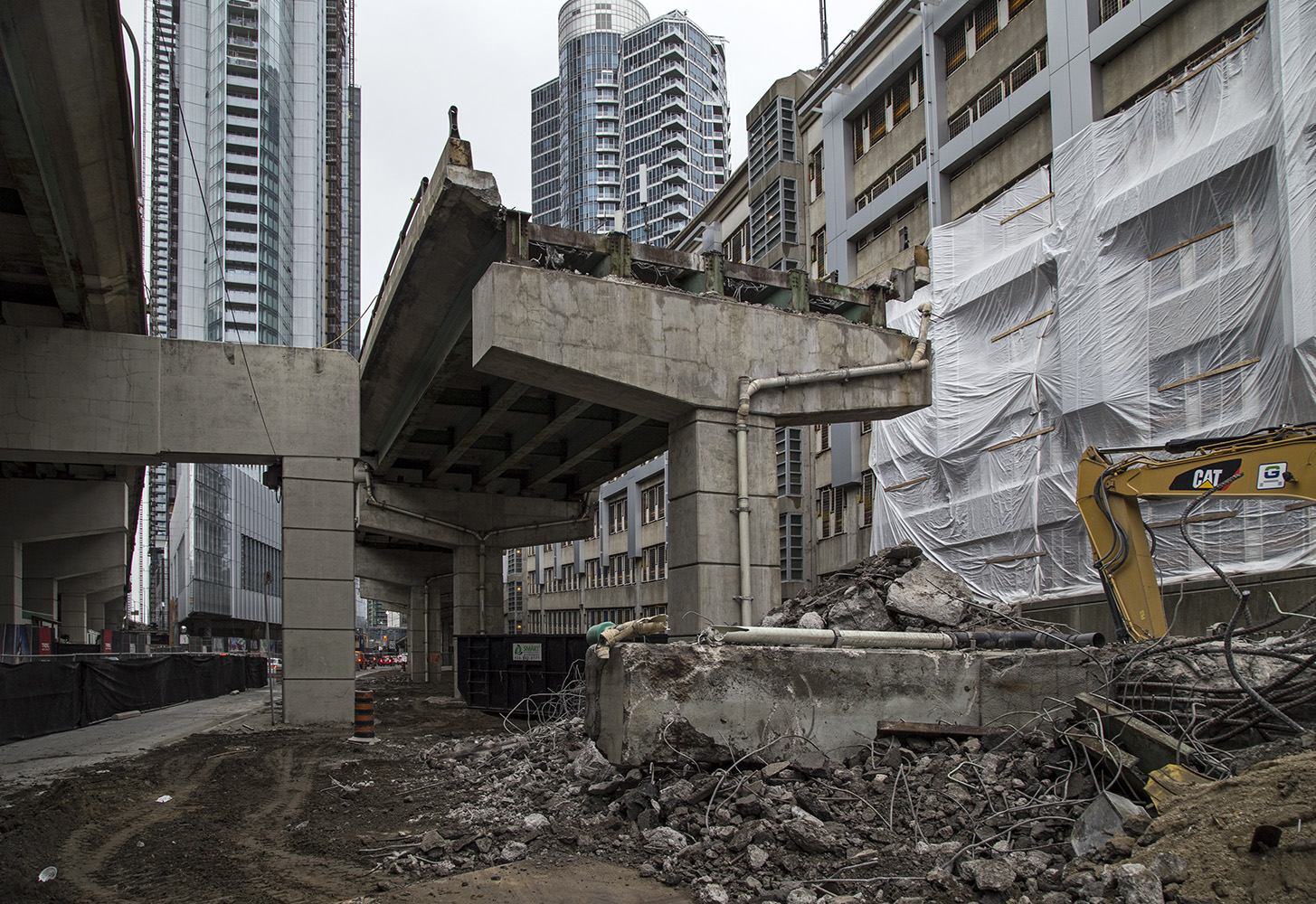
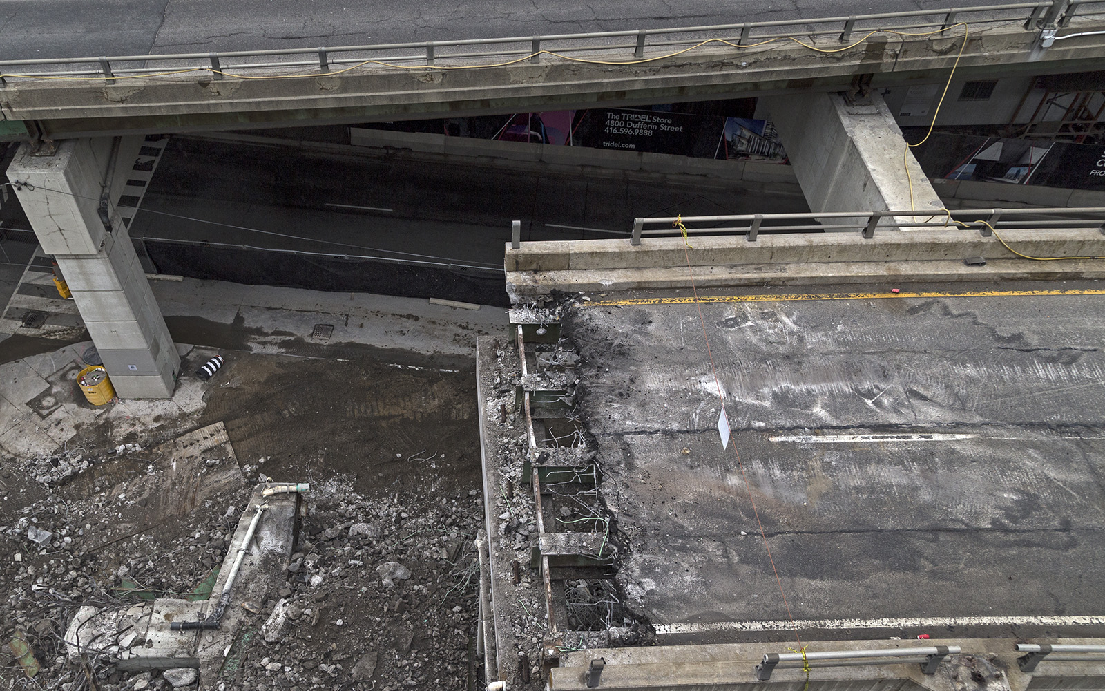
20170506. A support bent lies in the dirt at the abrupt end of the York / Bay / Yonge off-ramp.
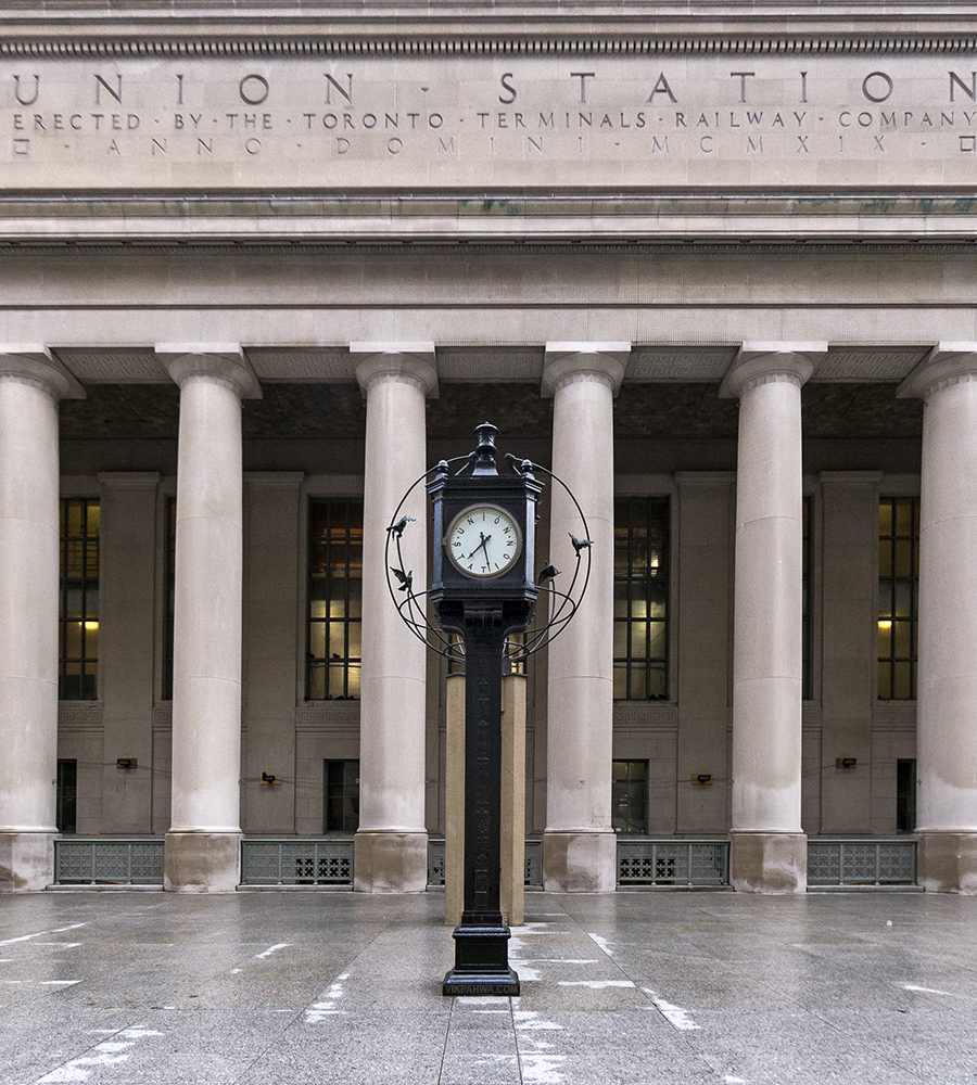
20170505. At Union Station the time is 28 minutes past A. #Toronto #architecture #infrastructure #transit
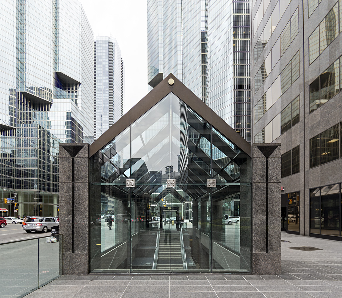
20170504. York Centre’s pellucid postmodern passageway to the Toronto PATH.
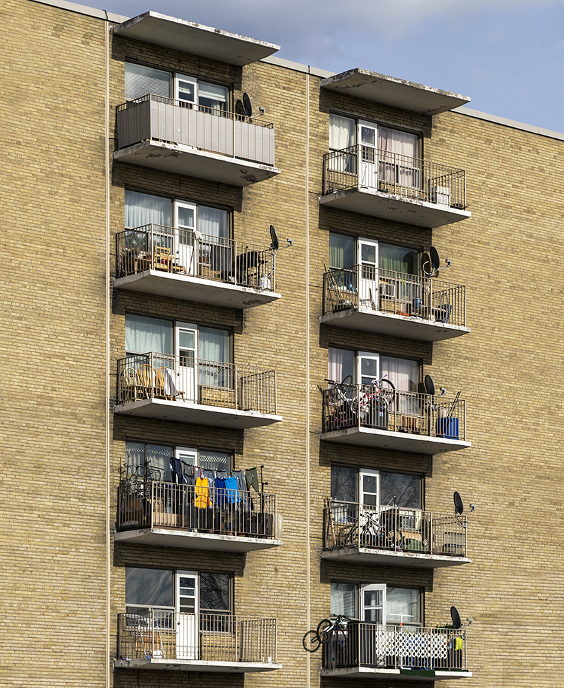
20170503. Balconies in Briar Hill.
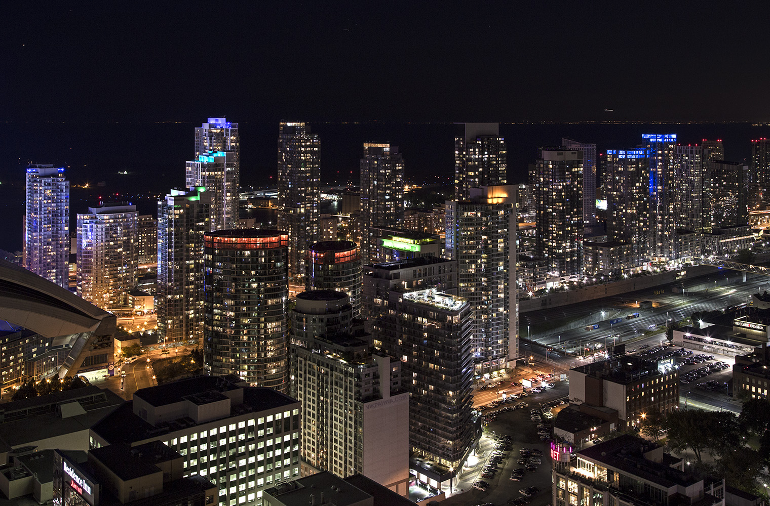
20170502. A sky view of Toronto’s CityPlace (Fall 2014).
20170501. When in Royal Bank Plaza’s underground Toronto PATH, don’t forget to look up!

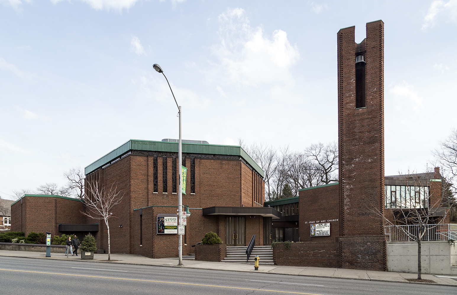
20170430. The late modernist St. Joan of Arc Church (William Saccoccio, 1967) with its hexagonal nave.
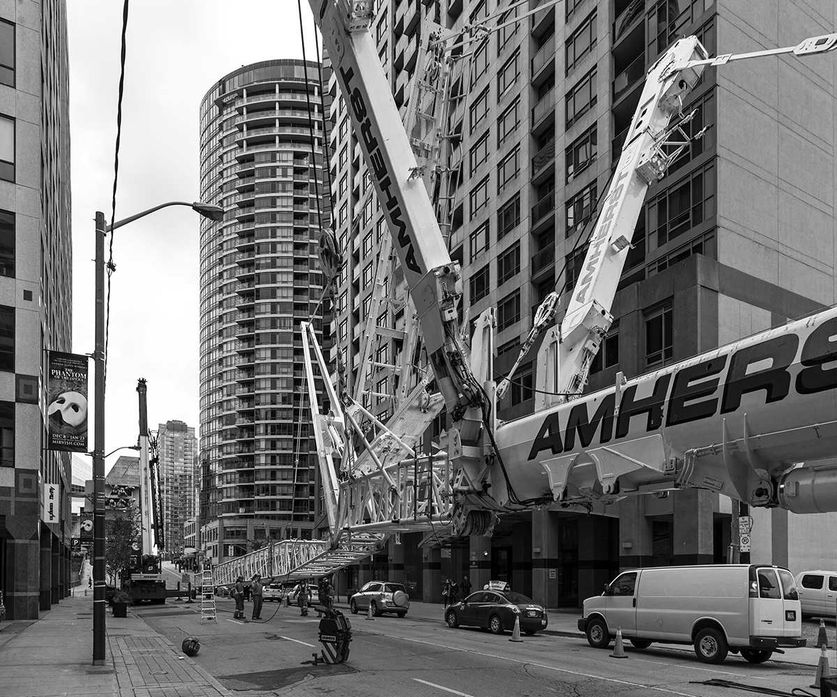
20170429. Assembling an Amherst crane on Blue Jays Way (October 2015).
20170428. Standing under the Scott Library and sky feeling inclined to go right. Minimal Aesthetic 111.

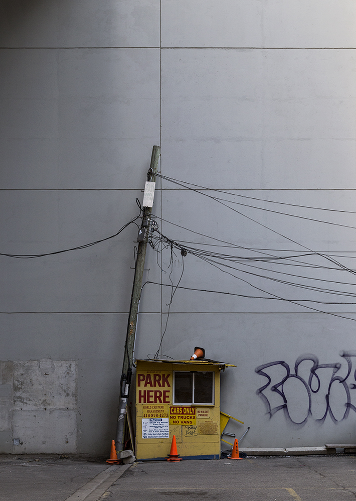
20170427. PARK HERE in the paneled parking lot.
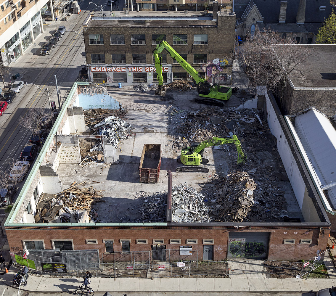
20170426. An aerial view of the anatomy of a demolition (of the single storey modernist Brink’s Express Company of Canada building).
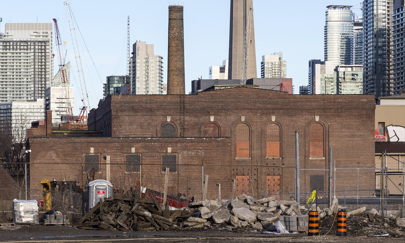
20170425. It’s time to re-imagine the derelict Wellington Destructor.
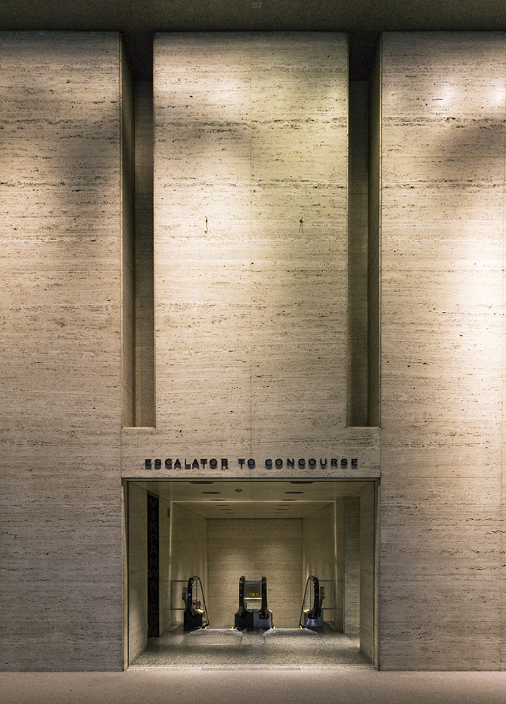
20170424. Walls of unfilled roman classic travertine frame the TD Bank Tower Escalator to Concourse.
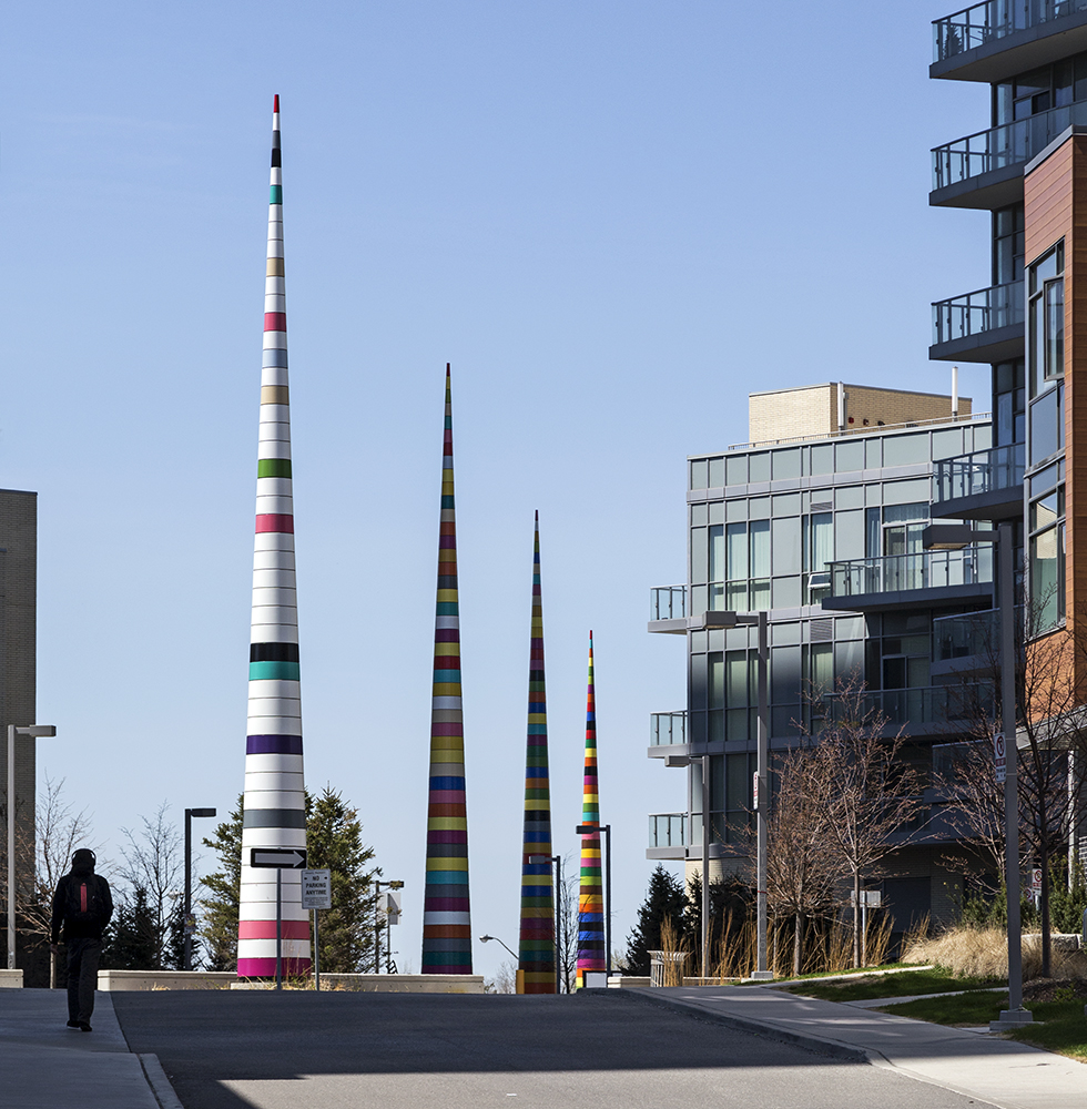
20170423. The inline conical pylons of Douglas Coupland’s public art Four Seasons.
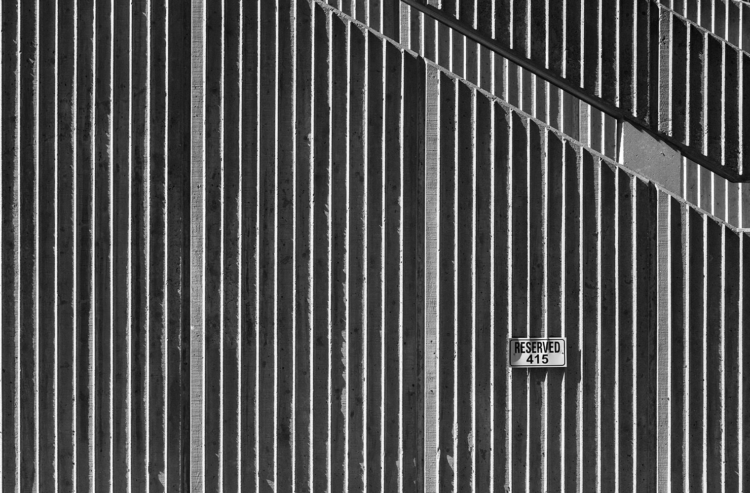
20140422. Precast Concrete Stairwell Wall. U of T Medical Sciences Building, Minimal Aesthetic 110.
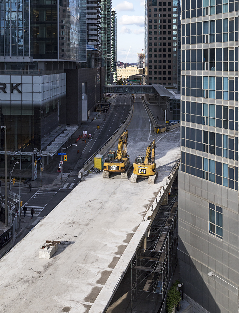
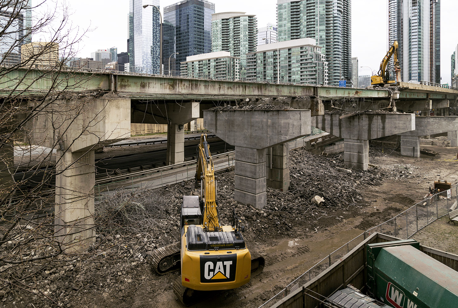
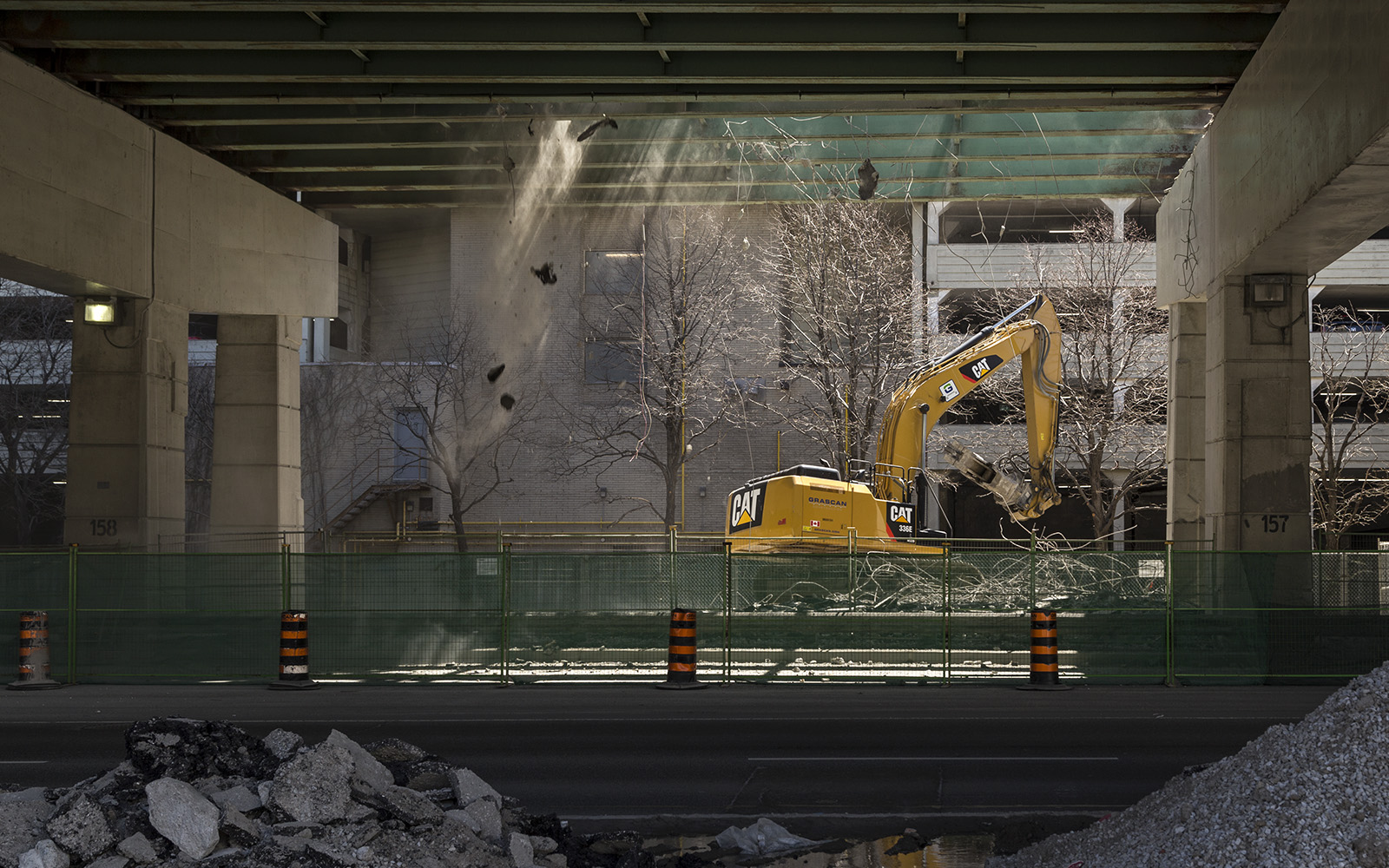
20170421. Demolition of the Gardiner Expressway’s York / Bay / Yonge off-ramp has progressed rapidly in four days.
20170420. Symmetry at the corner of Royal Bank Plaza South.
