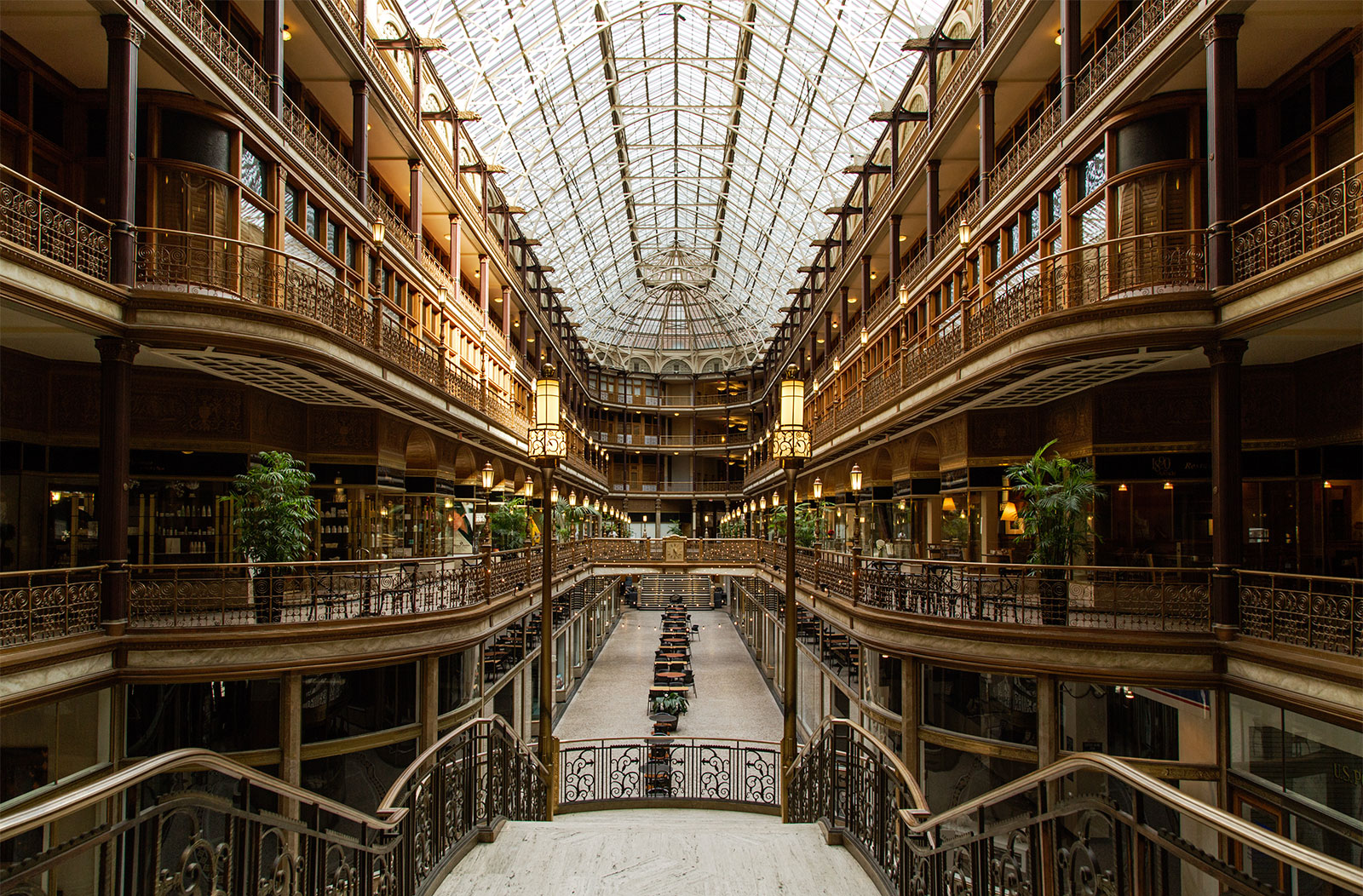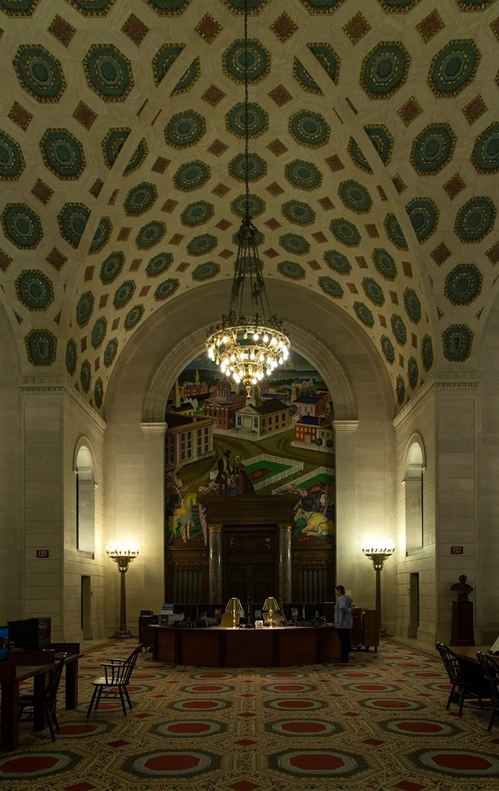
Unlike Toronto, you are allowed to take pictures inside the library without applying for permission!
Category Archives: photos
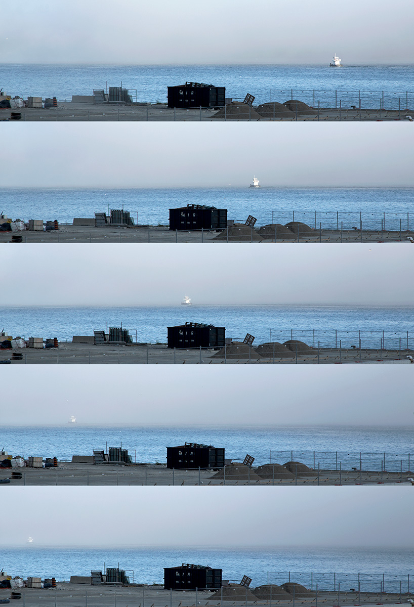
20140823. A composite image showing a boat disappear on the Toronto Harbour as a sudden fog rolled in yesterday.
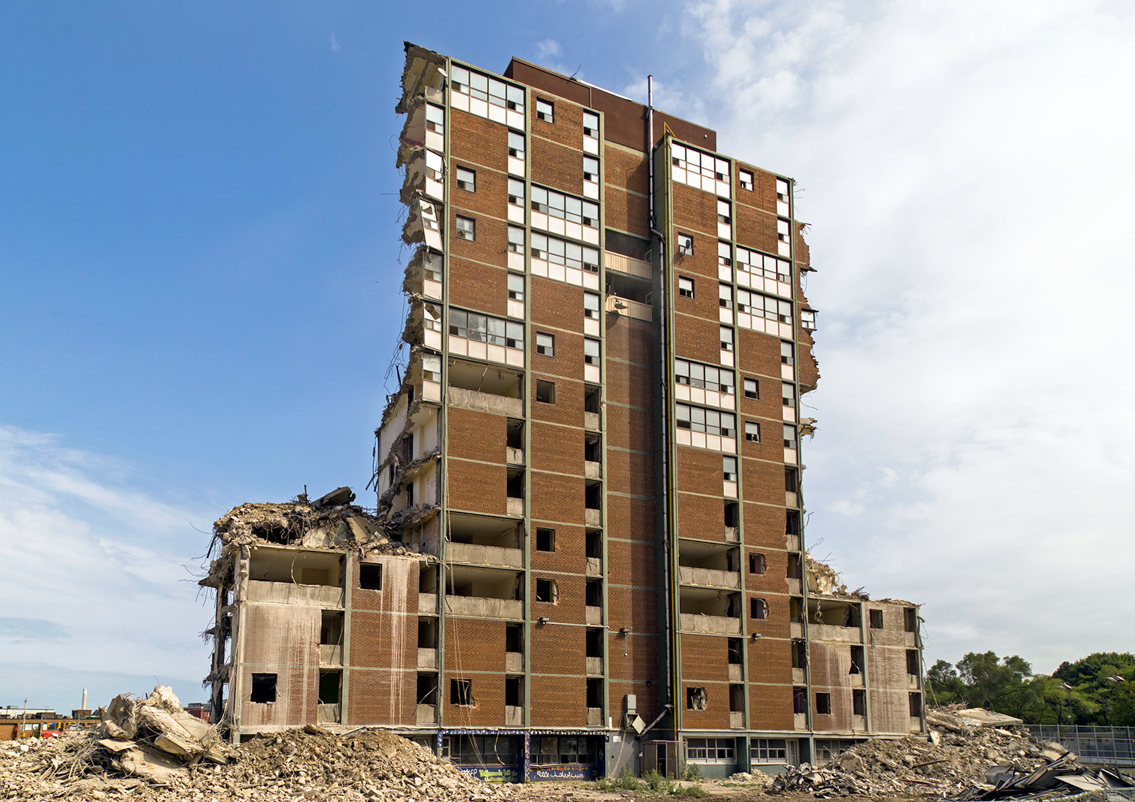
20140822. Modernist high-rise demolition cross-section in Regent Park, Toronto.
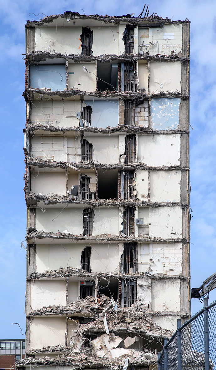 We should applaud the revitilization in Regent Park but should also appreciate the design of these modernist towers before all five are gone.
They were very unique. John Bentley Mays did a good job describing these apartments: “Every one of the five high-rises is a stack of 97 one-, two- and three-bedroom apartments, each disposed, like a small townhouse, on two floors. By eliminating corridors on every second floor — the elevator skips the floors without hallways — Dickinson was able to open out the common area in each apartment to the width of the whole slab. The results: a sense of spaciousness, light coming from two directions, good cross-ventilation and views of Lake Ontario for almost every resident of the towers.”
20140821. Now choose from 28 doors when entering the Union Station subway or underground PATH system in Toronto. Minimal Aesthetic 39.
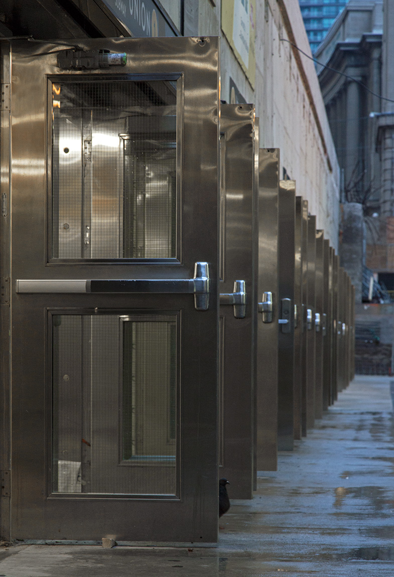 Alternate Caption: 20140821. Pigeons use the subway too.
If you are taking the Yonge line, enter from the east doors (farthest) and if you are taking the University line, enter from the west doors (closest). What concerns me is if you want to go into the underground PATH, you must come through the west doors or you will be met by a bank of 17 turnstiles where once you could just walk through.
20140820. The half-demolished 1958 Peter Dickinson modernist high-rise in Regent Park, Toronto.
20140819. Sections of the TTC’s new Union Station platform (Toronto) are quite wide but very, very white.
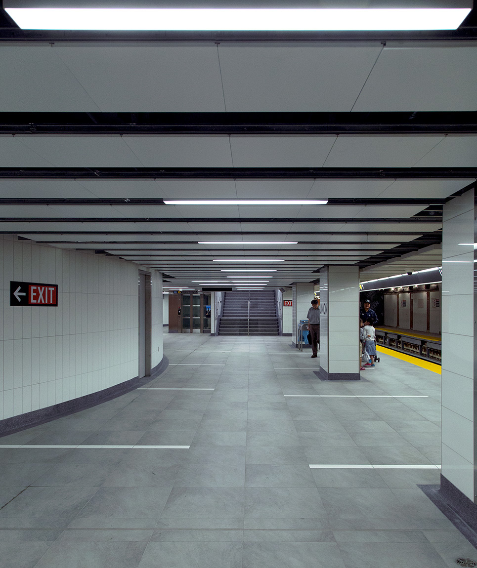 Apologies for suggesting the entire platform was narrow. Will this platform change from white to grey over time from subway train grime?
20140818. Finally, the TTC’s Union Station (Toronto) has its second, albeit narrow, platform.
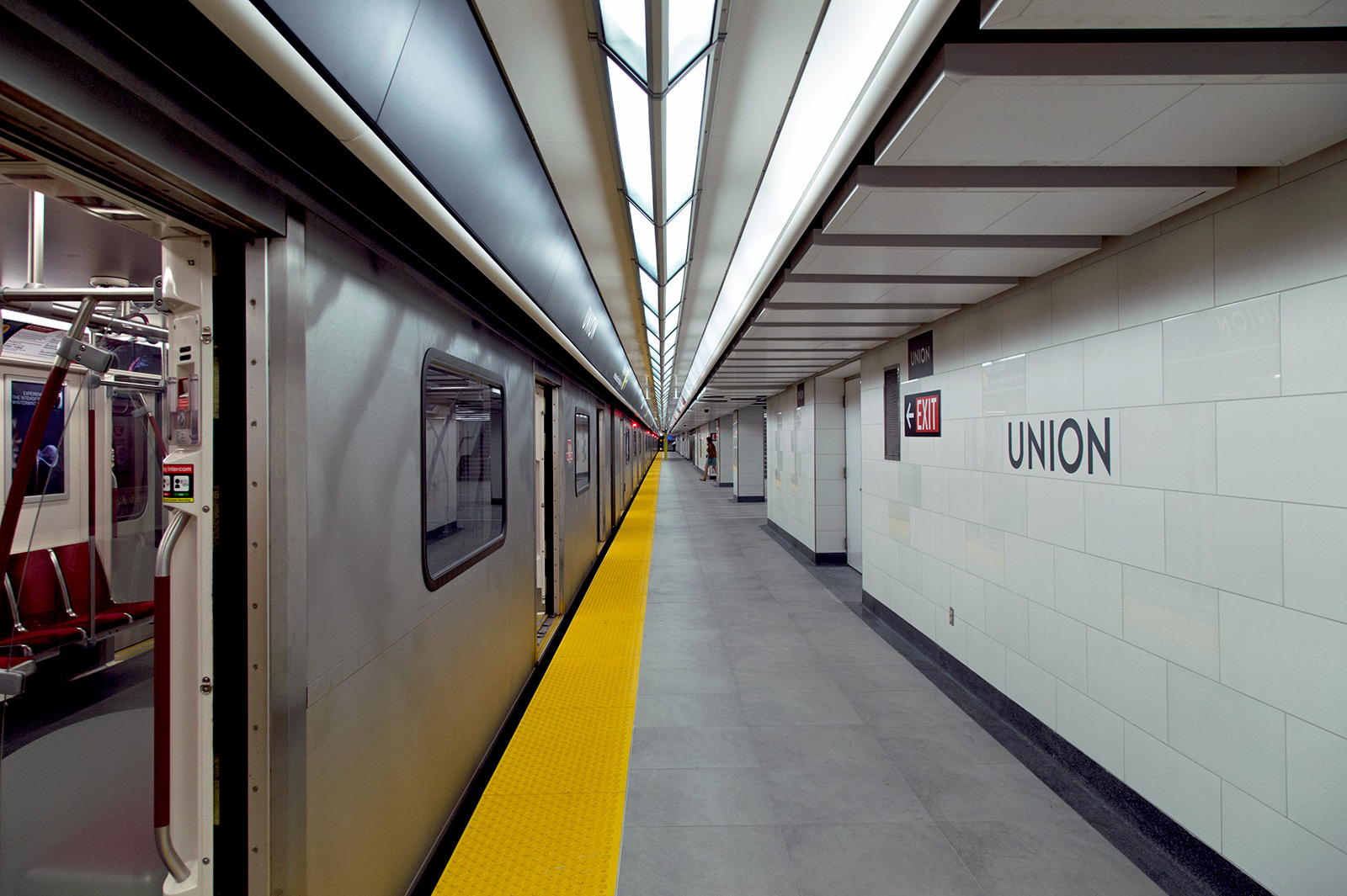
The new platform services trains heading northbound on the Yonge line. Note: a) the wayfinding signage above the train (similar to stations to the north), b) the ceiling panels that snap in/out of place allowing easy access for servicing, c) the exposed concrete floors and d) the matte wall tiles with the occasion glossy ones thrown in.
20140817. White circles in glass rectangles. Minimal Aesthetic 38.
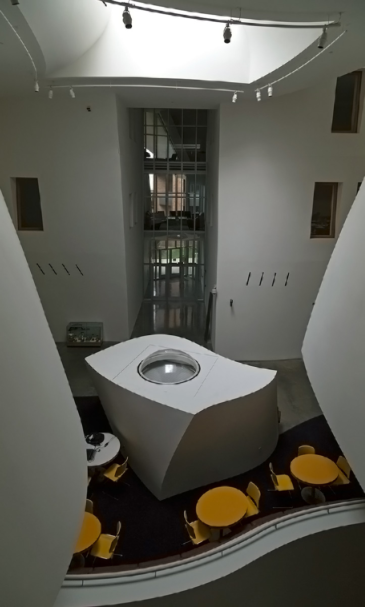
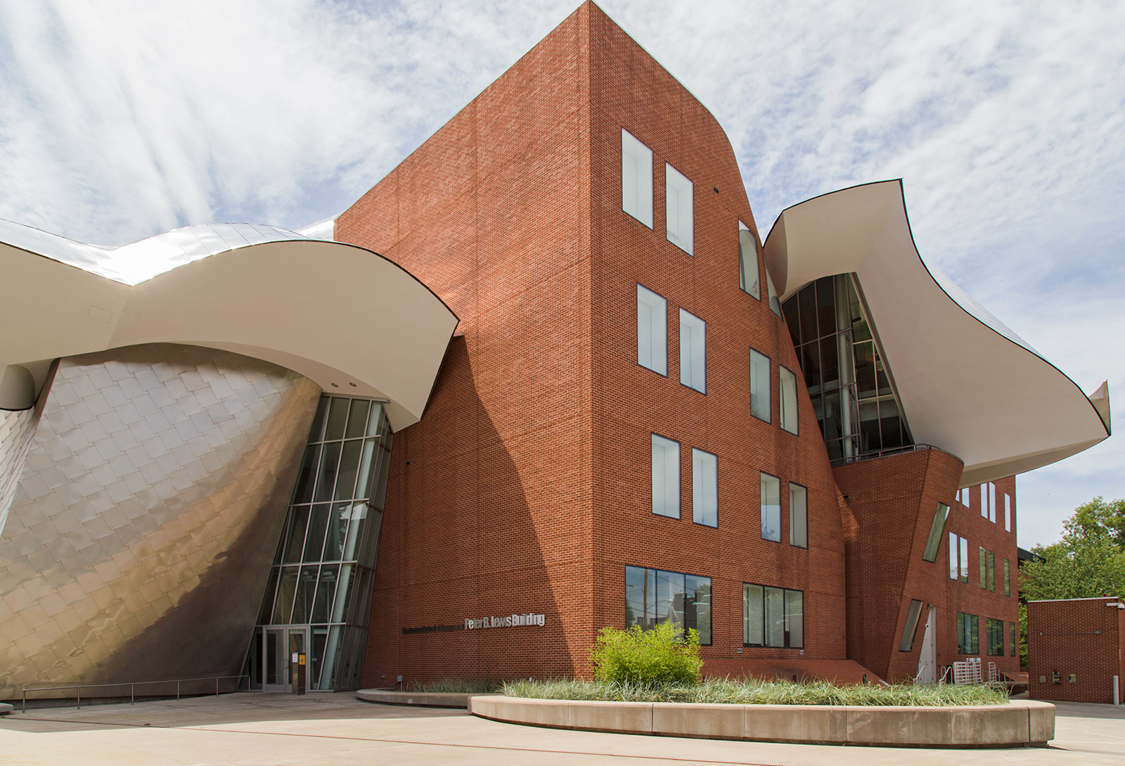
20140816. Light shines through two skylights to brighten a basement classroom in Frank Gehry’s Peter B. Lewis Bldg, Cleveland.
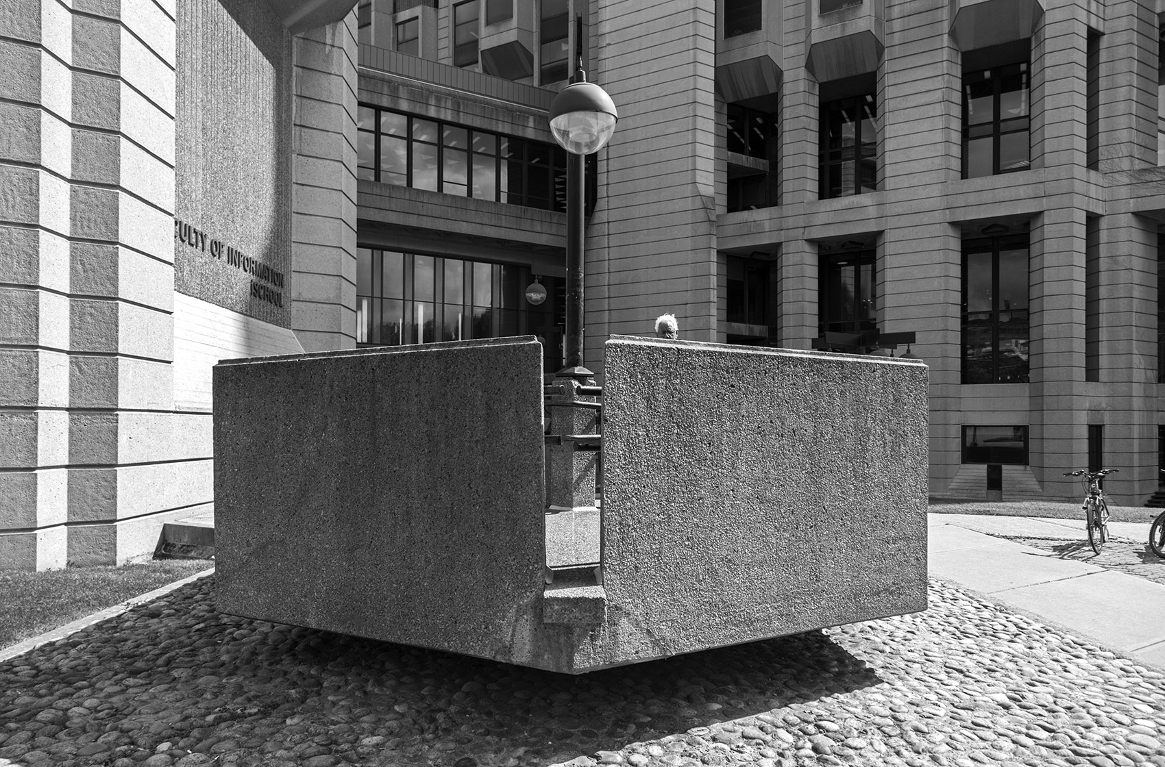
20140815. The floating ramp and nice lines of the Brutalist Robarts Library (University of Toronto).
20140814. The deconstructivist architecture of the Frank Gehry-designed Peter B. Lewis Building (c.2002) in Cleveland.
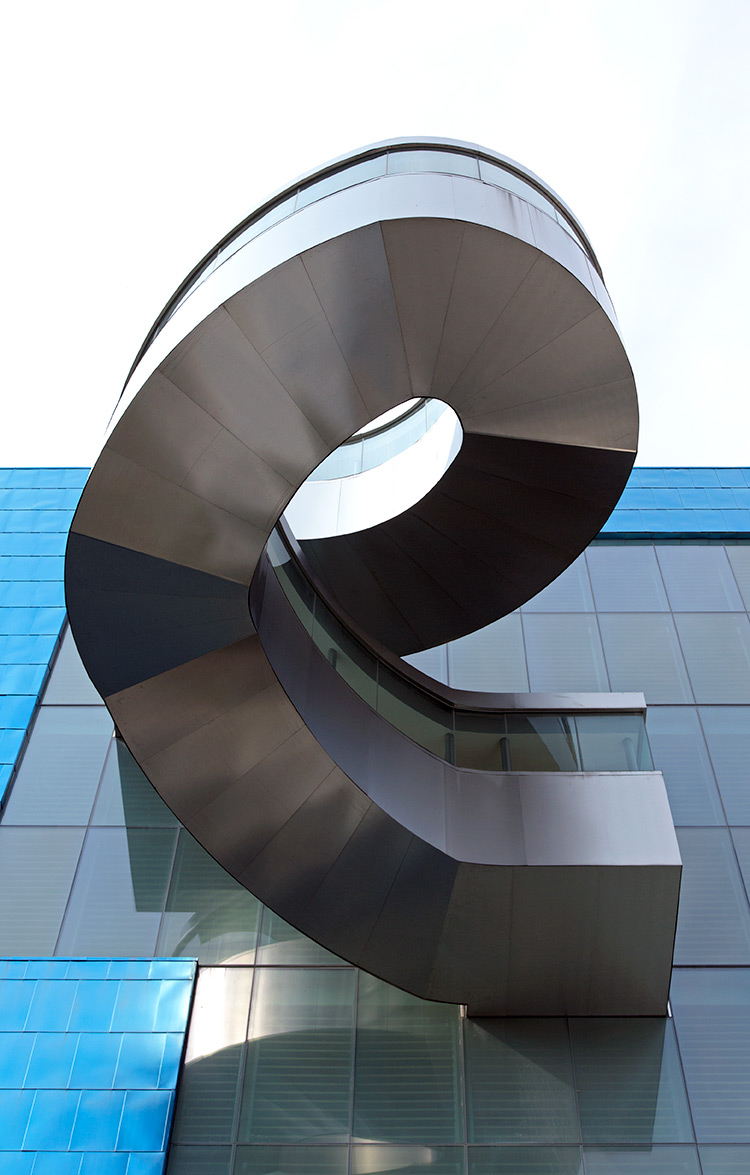
20140813. The protruding stairwell at the Art Gallery of Ontario, a Frank Gehry redesign. Minimal Aesthetic 37.
20140812. The weird and wonderful Frank Gehry-designed Peter B. Lewis Building (c.2002) in Cleveland.
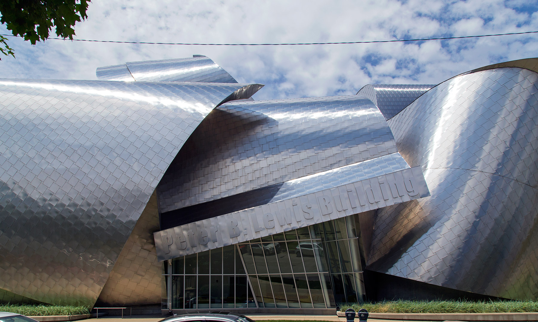
This is the home of the Weatherhead School of Management at the Case Western Reserve University in east Cleveland. Wait until you see the rest of this building!
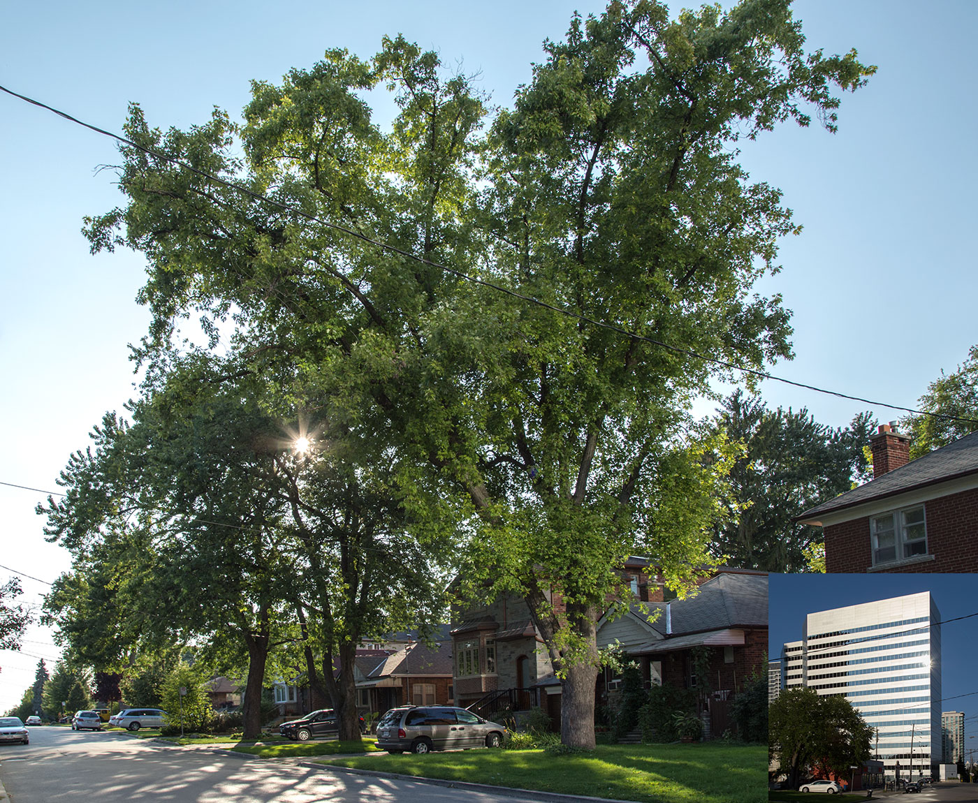
20140811. A front-lit tree with the sun shining through from behind.
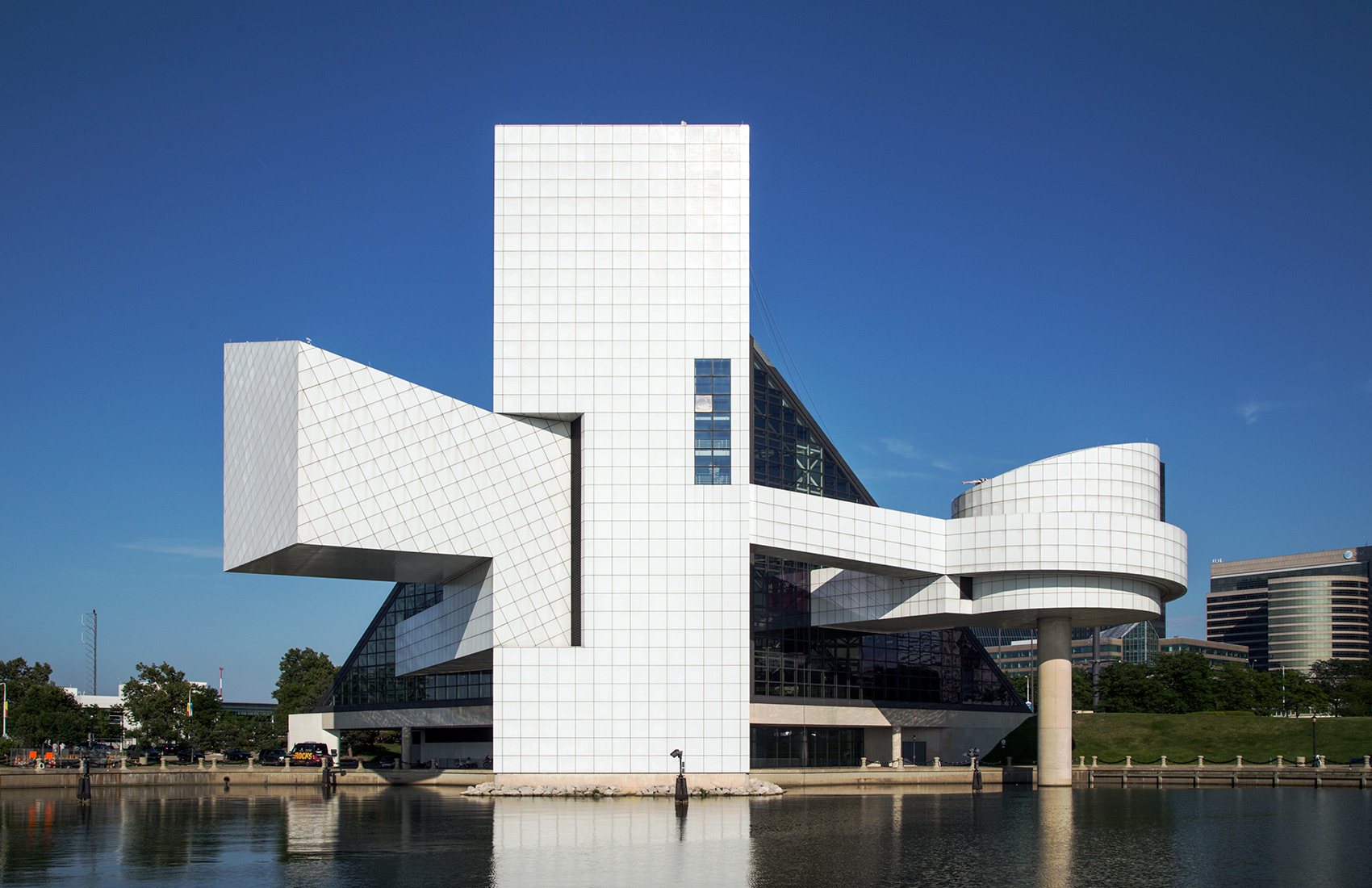
20140810. The rear view of the great I.M Pei’s Rock and Roll Hall of Fame (c.1983) in Cleveland.
I.M. Pei designed Commerce Court in Toronto.
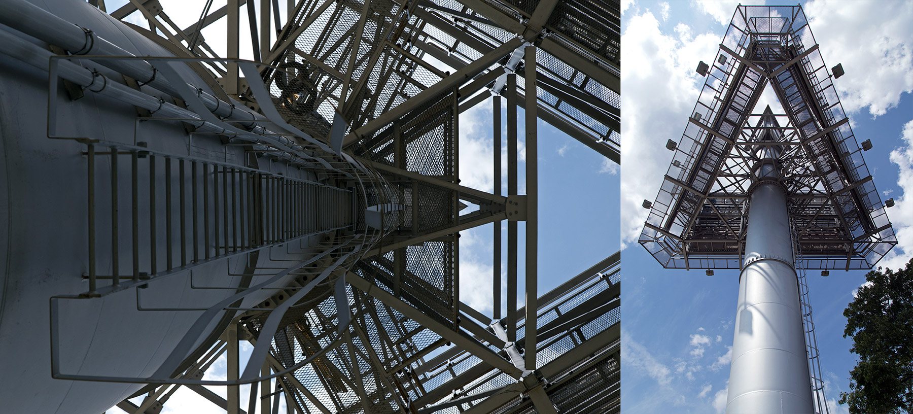
20140809. Two views of a giant three-sided billboard from below. Exhibition Place, Toronto.
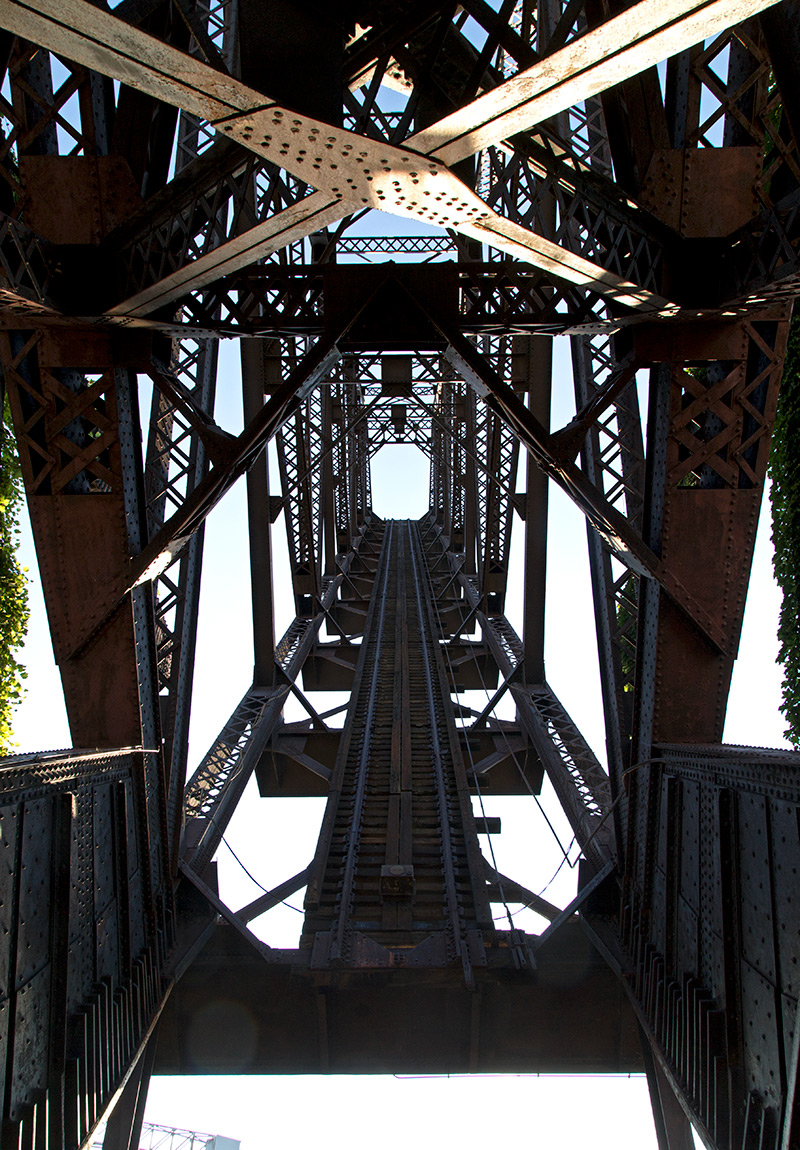
20140808. Looking UP at Cleveland’s 1907 B&O Railroad Bridge No.464 – a single-leaf rolling lift bridge.
20140807. Attention! Go ziplining at Toronto’s EX this year from platform rigging secured by guy wires.
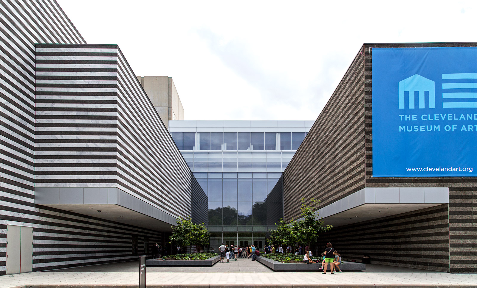
20140806. The stepped and striped east face of the Cleveland Museum of Art.
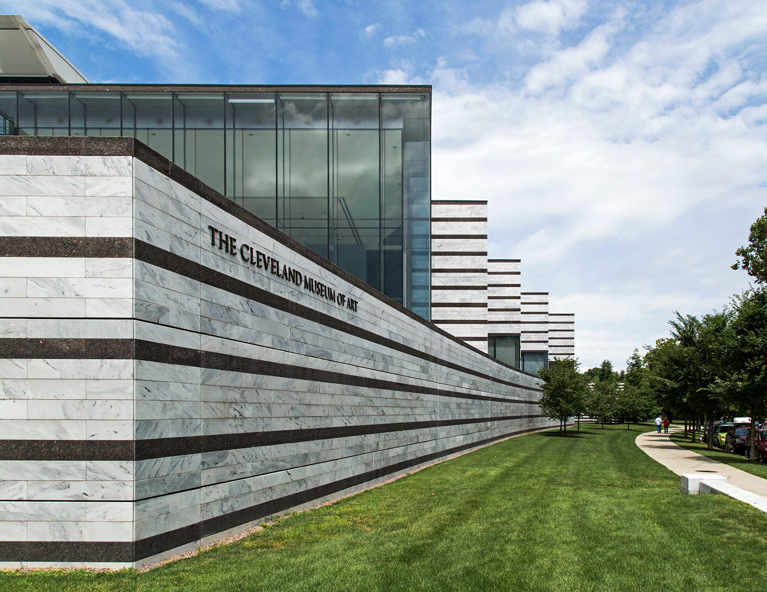
This latest addition to the museum connects the original museum building with the 1971 addition through marble/granite stripes that change in character. Near the striped 1971 addition the new wing features the same stripe ratio whereas near the original building, as shown above, the marble stripes outnumber the granite stripes as the original building is all white marble.
20140805. We are the Pillars of Justice. Sculpture by Edwina Sandys (c.2007) outside Toronto Courthouse at 361 University.
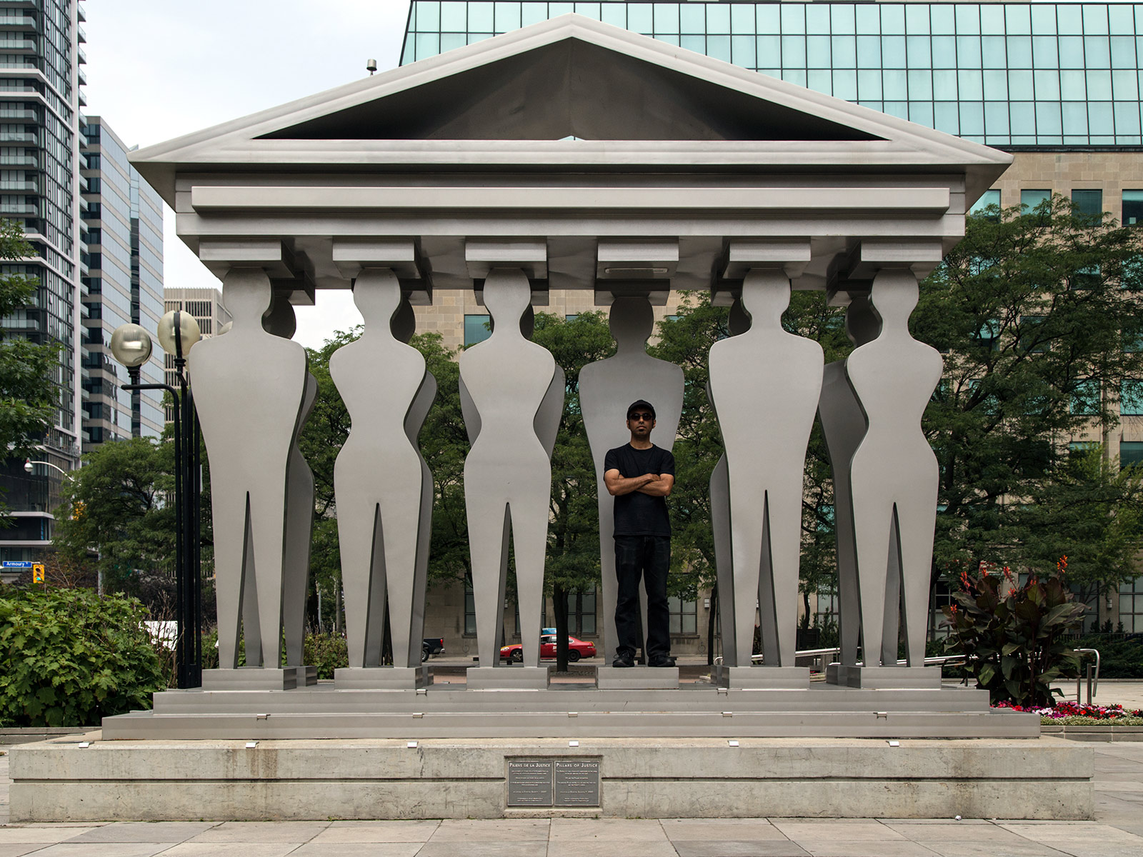
The plaque reads “Pillars of Justice. The People of our community participate in the legal system by serving on the Jury. We are the Pillars of Justice. The missing pillar invites you to imagine that you are the twelfth juror.”
20140804. The Cleveland Museum of Art’s new football-field-length glass atrium with original museum facade.
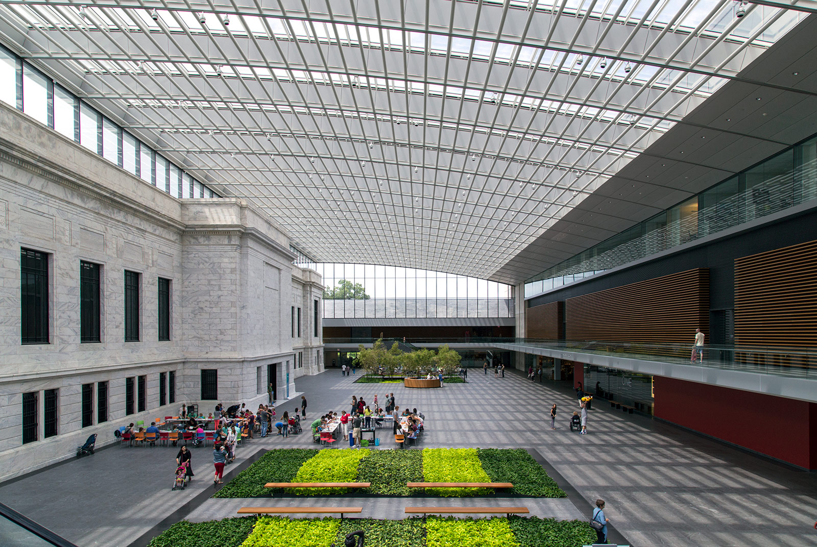
If you have watched the movie Captain America: The Winter Soldier, you may recognize this atrium as SHIELD headquarters.
20140803. The Cleveland Museum of Art’s banded Brutalism; a striped facade of white marble and brown granite.
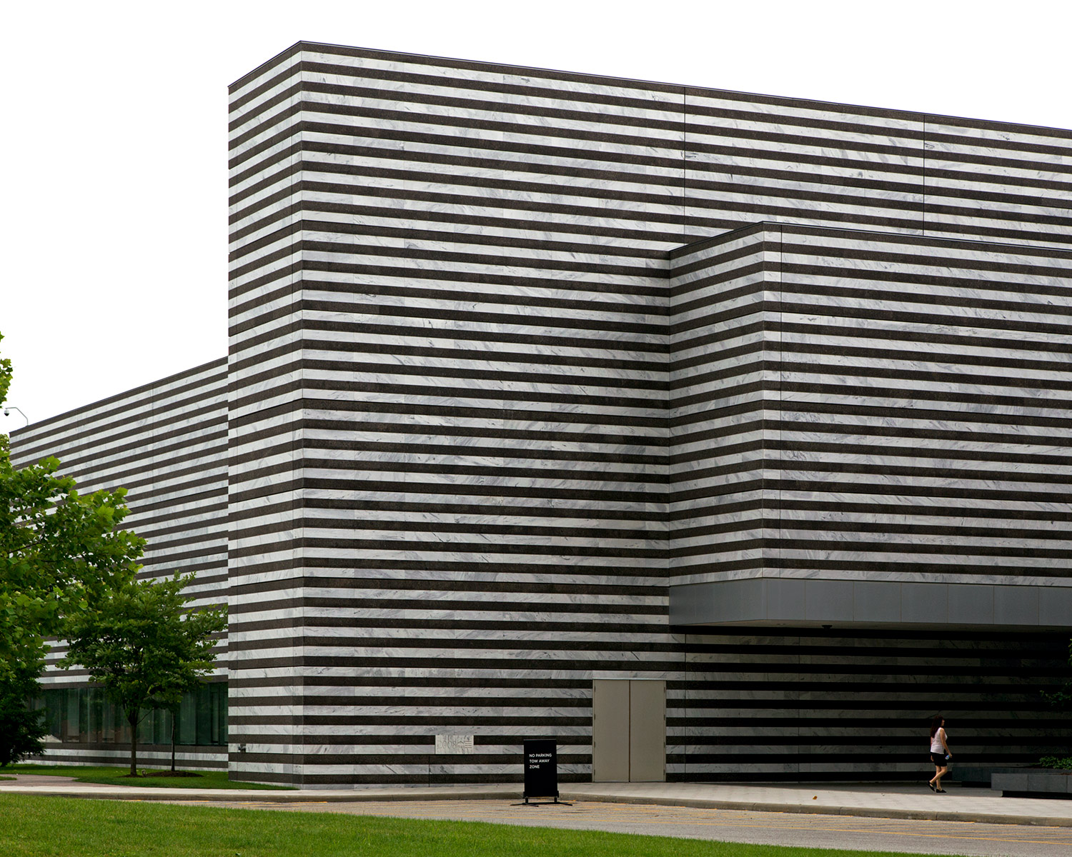
This most recent addition uses the same white Georgian marble as the original 1916 building. The 1 to 1 ratio of white to brown stripes acknowledges the equally banded brutalist 1971 addition. As the stripes move closer to the original building, the ratio of white to brown stripes increases until it is almost all white acknowledging the original building.

